TYPOGRAPHY - FINAL COMPILATION & REFLECTION

Maydeline (0335392)
Typography
Final Compilation & Reflection
INSTRUCTIONS
Exercises
Project 1
Project 2
Final Project
SUBMISSIONS
Calligraphy
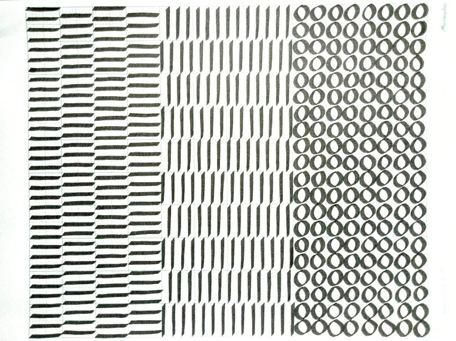 |
| Fig 1.1 Final Outcome : Horizontal, Vertical, Circular strokes |
 |
Fig 1.2 Final Outcome Of Letters : A-Z |
 |
| Fig 1.4 Final Outcome : A4 White Paper |
Lettering
 |
| Fig 1.5 Final Outcome of Name (Digitised) |
 |
| Fig 1.6 Final Outcome of animated lettering - Trendy (Animated) |
Type expression
 |
| Fig 1.7 Final Outcome of Type Expression |
 |
| Fig 1.8 Final Outcome of Rage (Digitised) |
 |
| Fig 1.9 Final Outcome of Rage (Animated) |
PROJECTS
Project 1 - Text Formatting & Expression
 |
| Fig 1.10 Thumbnail for Project 1 |
Fig 1.11 Embedded Pdf File of Project 1
 |
| Fig 1.12 Printed Book (Front Cover-Page 1) |
 |
| Fig 1.13 Printed Book (Page 2-3) |
 |
| Fig 1.14 Printed Book (Page 4-5) |
 |
| Fig 1.15 Printed Book (Page 6-7) |
 |
| Fig 1.16 Printed Book (Page 8) |
 |
| Fig 1.17 Thumbnail of Project 2 |
 |
| Fig 1.18 Final Outcome (Digitised) |
Final Project - Expression, Hierarchy and Composition
 |
| Fig 1.19 Final Outcome Poster |
 |
| Fig 1.21 Final Outcome Poster (Animated) |
Fig 1.22 Final Outcome Poster PDF
REFLECTION
EXPERIENCE
My experience with Typography was very thrilling. It was fun to learn about type design and how to do it or design it better to make readable and good. I definitely have learned a lot this semester that I learned how to do calligraphy, digitise the letters, animate(gif), kerning words/sentences, expressing using typeface and many more. However, there were some times that my ideas/works were being rejected because they were not good enough but I took those feedbacks from my lecturers as a motivation to keep me improve/develop more to a better level. Even though the lecturers were hard on me, I understand that they have good intention to push my limits to create best outcome that I would've never expect I could do it. They always told me to sketch a lot, look at references and create better design works than the examples. In conclusion, this module is very tiring, exciting and industrious.
OBSERVATION
At first, I thought that typography was just putting letters and making them unique to make people like the design that the designers have made. However, as months went by, it became clear that Typography isn't something that we should take for granted. It is definitely not easy to do and it takes time to learn a lot about the letters. It takes a lot of time, sketches and ideas to produce a good design. When I observed people's works and mine, I noticed that readability is very important so that people could read. I became very cautious of the typefaces that I chose, the composition, hierarchy, balance, and other design principles. Small little details could really make big changes that is why I became more aware to the details and fix it until it looks good. As I learn, I became more adaptable and have the ability do identify good and bad design.
FINDINGS
As I learned Typography, I found the module really interesting as I got to learn lots of things about typography. I finally understood that Typography plays a significant role in design and it is truly needed in design, it can change the entire look and feel of a design it attract's the readers' attention even though it's just words/letters. I find that making a blog and posting our works were strongly effective as I can see the progress of my work and also it helps me to be more organise. At first I thought that all design are good but as I learned, I could identify bad typography and people could get conditioned by it. We have to start making good typography and study more and should get used to it instead of looking at the bad typography.


Comments
Post a Comment