TYPOGRAPHY - EXERCISES
TYPOGRAPHY - EXERCISES
 29.08.18 - 03.10.18 (Week 1 - Week 6)
Maydeline (0335392)
Typography
Exercises
LECTURES
Lecture 1: Introduction to Typography
29.08.18 (Week 1)
We started the class with a brief introduction of the module and the upcoming activities we were looking forward to in these few weeks. We created our blogger sites (e-portfolio) where we would be able to showcase and document the process of exercises and projects. Moreover, Mr Vinod also gave us a sample of a senior's blog which would beneficially helped us in creating our blogs. Additionally, a list of materials to bring for the future projects were informed, such as; Artline calligraphy pen and A4 graph papers. Following this, we proceeded with the first lecture, an introduction to typography.
Typography is the style of how we see things based on experience or exposure. On the other hand, it is stated in the wikipedia that typography is the art and technique of arranging type to make written language legible, readable, and appealing when displayed.
Font ("foundry" )
Process of creation of typeface.
Typeface
Individual face from one family/within a type family, such as Arial bold.
Type family
Complete set of related typefaces having identical design characteristics, such as Arial, Helvetica, Times Roman.
Lecture 2: Basic/Describing Letterforms
05.09.18 (week 2)
We learned about the specific parts of letterforms.
Median : imaginary line defining the X-height of letterforms.
Baseline : the imaginary line the visual base of letterforms.
X-height : The height in any typeface of the lowercase.
Stroke : Any line that defines the basic letterform.
Apex/Vertex : The peak of the triangle of an uppercase.
Arm : short strokes of stem.
Ascender : A stroke on a lowercase letter that rise above the meanline.
Barb : A sharp curved point
Beak : A sharp spur, connected to the arm by the terminal.
Bowl : A curved stroke enclosing the counter form of a letter.
Bracket : The transition between the serif and stem.
Cross bar : The negative space that is fully/partially enclosed by a letterform.
Cross stroke : A horizontal stroke that intersects the stem of a lowercase.
Descender : A stroke on a lowercase letterform that falls below the baseline.
Ear : A small stroke that projects from the upper right side of the bowl of the lowercase roman g.
Crotch : An acute, inside angle where 2 strokes meet.
EM space : the width of the capital M / point size of the font.
EN space : half the width of an em.
Finial : Tapered curved end on letters such as C or e.
Leg : The lower diagonal stroke on the letter k.
Ligature : The character formed by the combination of two or more letterforms.
Link : The stroke that connects the bowl and the loop of a lowercase roman g.
Loop : The bottom form of the lowercase roman g.
Shoulder : A curved stroke projecting from a stem.
Spine : The main curved stroke of a lowercase or capital S.
Spur : The point at the end of a curved stroke.
Stress : The orientation of letterform, indicated by the thin stroke in round forms.
Swash : Decorative elements.
Tail : A diagonal stroke/loop at the end of a letter.
Terminal : The end of any stroke that does not terminate with a serif.
Uppercase : Capital letters.
Lowercase : Minuscule letters.
Lecture 3: -
12.09.18 (week 3)
We continued the exercise of the hand that we had selected.
Lecture 4: Development of Typography
19.09.18 (week 4)
This week's lecture is about the development of typography and lettering.
Early letterform development : Phoenician to Roman
Before alphabets were created, people used drawing pictographs where there were pictures depicting their subjects. Based on the tool that people used, the structure of the letterform would look like the tool. The reed pen was in use, a tool which was held at an angle to the page. This created the variation in the line, and it helped the formation of the lower case letters.
Phoenician Alphabets
The Phoenicians developed a writing system around 1200 B.C.E where the symbols represent sound. The Phoenicians were traders and merchants, in need of a simple way of tracking their commerce. These letters could be written quickly and were much easier to learn. Their alphabets, consisting of 20 simple marks, accomplished this with aplomb. The alphabets had no vowels and it was read from right to left.
Greek Alphabets
Around 800 B.C.E, the Greeks adopted the Phoenician alphabets. They saw the form of the writing to preserve the knowledge they held. They added vowels and standardised the letterforms. Around 403 B.C.E, the Greeks had all capital letters, were designed with as few curved strokes.
Roman alphabets
The Romans adopted the Greek alphabet and changed some letters. They added F and Q right off the bat and gave letters simplified names. They also had only capital letters for a long time.
Lecture 5: -
26.09.18 (week 5)
We animated the lettering in Adobe Photoshop and Illustrator.
Lecture 6: -
04.10.18 (week 6)
We did the type expression and animate one of it.
INSTRUCTIONS
Calligraphy (Week 1)
This week's exercise is using the Artline calligraphy pen 3.0 and draw horizontal, vertical and circular strokes. By practicing regularly, we are able to get used to draw with the pen even more.
Lettering (Week 4)
This week's exercise is to create our own lettering which reflects/shows our characteristic.
Animated Lettering (Week 5)
This week's exercise is to animate our lettering that reflects our characteristic using Adobe Illustrator and Photoshop. For the lettering exercise, I'm trying to express my name as fashionable(trendy).
Animated Type expression (Week 6)
This week's exercise is to create 6 type expressions which are sparkle, tall, rage, heavy, blur and float.
FEEDBACK
Week 1
Mr Vinod said that the overall result was good, however the circular lines needed to be improved by drawing more narrow circles.
Week 2
Mr Shamsul complimented how well I write the Chancery letters and he told me to focus on the alphabets first followed by the spacing.
Week 3
Mr Shamsul commented that the flow of my Black letter writing isn't good that the size of the alphabets isn't constant. He mentioned that I should practice even more.
Week 4
For the calligraphy exercise, Mr Vinod said that the size of the alphabets are too big and the spacing of the letters I wrote aren't right yet. The sentences that I've chosen didn't have the right contrast yet I was advised to choose another one. On the other hand, Mr Vinod and Mr Shamsul agreed that my lettering sketch was expressing "trendy" as in the term of fashionable and it was well done. Hence, Mr Vinod mentioned that we should focus on only one characteristic/personality in the lettering exercise.
Week 5
For the lettering exercise, Mr Vinod agreed on the animation that I saw in Pinterest and he said that if I wanted to do it, I had to do it step by step in a long process by using lots of art boxes. He also gave us advice to use more art boxes so that the result of our animated lettering would look better.
Week 6
Mr Vinod and Mr Shamsul said that my sparkle and float were too static and I needed to make some changes by rotating the words. Additionally, the type expression "blur" wasn't good as well. After some changes, they finally approved all of the type expression and asked me to pick one to animate. I chose the word "rage" and animated it. I showed Mr Shamsul my final result and he said that it was okay as it showed rage, but he added some feedback to enlarge the size of the word "rage" at the end as the word was expanding out of the box. Furthermore, Mr Vinod said that we should start paying attention at how we take pictures for our e-portfolio.
REFLECTION
EXPERIENCES
Week 1
This week's lecture is very interesting that I gain lots of knowledge of Typography. It shows me that Typography isn't just words, however it's more than that. Because of its variation, I want to explore and try the various types.
Week 2
It's very interesting to learn about 4 different types of calligraphy hands. Although it was hard, it was fun at the same time.
Week 3
I had a very hard time to control my hand to get the right flow to write my sentences because my hand wasn't really stable and sometimes the size would get either larger/smaller where it's not constant.
Week 4
I found it very tough to find the right lettering for the exercise because it was really hard to find the right characteristic to express myself.
Week 5
It was very hard for me to animate the lettering because I wasn't sure how to do it with adobe illustrator. However, it was very helpful and fun although a bit annoying.
Week 6
It was a bit stressful when I had to make the 6 type expression because some of the words were a bit too hard.
OBSERVATIONS
Week 1
I observe that we need lots of practice to create the perfect lines and lots of updates and documentation in blogging.
Week 2
I observe that there are some parts of the letterforms that we have to be aware of and as well as the spacing of the letters.
Week 3
I observe that not only do I have trouble with the letterforms, but some people as well. It will take lots of practice to get there.
Week 4
I observe that lots of people have different and interesting lettering based on their characteristic and how they express it.
Week 5
I noticed that everyone had different lettering and they were all really minimalistic.
Week 6
I really like how other classmates work on the type expression. They were different and interesting at the same time.
FINDINGS
Week 1
While I was doing the assignments, I had to control my hand in the pressure and angle in drawing the lines. It was hard at first as I wasn't used to it, however I noticed that I've got better and used to the pen.
Week 2
It was very hard to choose which hand that suits me the best. In the end, I picked Chancery hand and tried to write the alphabets. It was really hard but fun at the same time.
Week 3
It was definitely very risky and challenging to change from Chancery to Blackletter hand. However, I got a bit more comfortable with Blackletter more than Chancery.
Week 4
While I was doing the lettering, I focused a lot that I forgot the time. However, finally I thought of something that was very unusual and new.
Week 5
I was a bit stressed when I was animating the lettering because I wasn't that familiar with it yet.
Week 6
While I was animating my type expression, I was really tired and a bit stressed as I really wanted it to turn out well.
FURTHER READING
Butterick's Practical Typography
Week 1 - Week 2
Chapter 1 : Letterspacing
Letterspacing is the adjustment of the horizontal white space between the letters in a block of text. Unlike kerning, Letterspacing affects every pair.
Lowercase don't ordinarily need letterpsacing nor do capital letters when they appear at the beginning of a word or sentence. It is because they're designed to fit correctly next to lowercase letters. However, if you use capital letters together, the spacing will look too tight.
https://practicaltypography.com
Perfect Typeface Combinations : Type Team
Week 3 - Week 4
Chapter : Hierarchy
Hierarchy is important because it introduces levels within the text; chapter headings, cross headings, captions and so on; and provides the reader with signposts they need to successfully navigate their way through the layout.
Point size and spacing are layout techniques that help to provide hierarchy, but there are other ways to achieve that which are by paying attention to the weight and form.
The bold and extended weights draw eye to the important information: what, when, where, and website.
Chapter : Size matters
Point size is an expression of the body height of a font rather than the size of glyphs. The body height of this virtual area is constant at every given point size, while the width varies with the width of font's glyphs.
If you set two typefaces together that are the same point size they will appear to be different sizes. However, to pair two or more typefaces in a layout where they need to appear similar sized, you must visually match the x-heights rather than simply set them at the same point size.
Chapter : Serif shapes and bracketing
Serifs can be either bracketed or unbracketed. A bracketed serif transitions in a smooth curve at the point where it joins a stroke, while an unbracketed serif joins the stroke abruptly, often at a right angle.
When using serif shapes as a signpost to a successful typeface combination, think about mood as well as context and practical requirements. Blunt organic serifs work well when used to conjure up a sense of history while sharp wedges can generate energy and give your type a cutting edge feel with a touch of traditional elegance thrown in for good measure.
Week 5 - Week 6
http://collaborgator.pbworks.com/f/indesign_typography.pdf
Chapter : Baseline Shift
A font's baseline is the lowest point of letters except those that extend the baseline such as "y" and "g".
You can use baseline to shift to adjust the baseline for one or more characters, either to create an effect or to format special symbols such as the trademark symbol.
Maydeline (0335392)
Typography
Exercises
LECTURES
Lecture 1: Introduction to Typography
29.08.18 (Week 1)
We started the class with a brief introduction of the module and the upcoming activities we were looking forward to in these few weeks. We created our blogger sites (e-portfolio) where we would be able to showcase and document the process of exercises and projects. Moreover, Mr Vinod also gave us a sample of a senior's blog which would beneficially helped us in creating our blogs. Additionally, a list of materials to bring for the future projects were informed, such as; Artline calligraphy pen and A4 graph papers. Following this, we proceeded with the first lecture, an introduction to typography.
Typography is the style of how we see things based on experience or exposure. On the other hand, it is stated in the wikipedia that typography is the art and technique of arranging type to make written language legible, readable, and appealing when displayed.
Font ("foundry" )
Process of creation of typeface.
Typeface
Individual face from one family/within a type family, such as Arial bold.
Type family
Complete set of related typefaces having identical design characteristics, such as Arial, Helvetica, Times Roman.
Lecture 2: Basic/Describing Letterforms
05.09.18 (week 2)
We learned about the specific parts of letterforms.
 |
| Fig 1.1 Letterform Anatomy |
 |
| Fig 1.2 Letterform Anatomy |
Median : imaginary line defining the X-height of letterforms.
Baseline : the imaginary line the visual base of letterforms.
X-height : The height in any typeface of the lowercase.
Stroke : Any line that defines the basic letterform.
Apex/Vertex : The peak of the triangle of an uppercase.
Arm : short strokes of stem.
Ascender : A stroke on a lowercase letter that rise above the meanline.
Barb : A sharp curved point
Beak : A sharp spur, connected to the arm by the terminal.
Bowl : A curved stroke enclosing the counter form of a letter.
Bracket : The transition between the serif and stem.
Cross bar : The negative space that is fully/partially enclosed by a letterform.
Cross stroke : A horizontal stroke that intersects the stem of a lowercase.
Descender : A stroke on a lowercase letterform that falls below the baseline.
Ear : A small stroke that projects from the upper right side of the bowl of the lowercase roman g.
Crotch : An acute, inside angle where 2 strokes meet.
EM space : the width of the capital M / point size of the font.
EN space : half the width of an em.
Finial : Tapered curved end on letters such as C or e.
Leg : The lower diagonal stroke on the letter k.
Ligature : The character formed by the combination of two or more letterforms.
Link : The stroke that connects the bowl and the loop of a lowercase roman g.
Loop : The bottom form of the lowercase roman g.
Shoulder : A curved stroke projecting from a stem.
Spine : The main curved stroke of a lowercase or capital S.
Spur : The point at the end of a curved stroke.
Stress : The orientation of letterform, indicated by the thin stroke in round forms.
Swash : Decorative elements.
Tail : A diagonal stroke/loop at the end of a letter.
Terminal : The end of any stroke that does not terminate with a serif.
Uppercase : Capital letters.
Lowercase : Minuscule letters.
Lecture 3: -
12.09.18 (week 3)
We continued the exercise of the hand that we had selected.
Lecture 4: Development of Typography
19.09.18 (week 4)
This week's lecture is about the development of typography and lettering.
Early letterform development : Phoenician to Roman
Before alphabets were created, people used drawing pictographs where there were pictures depicting their subjects. Based on the tool that people used, the structure of the letterform would look like the tool. The reed pen was in use, a tool which was held at an angle to the page. This created the variation in the line, and it helped the formation of the lower case letters.
 |
| Fig 2.1 Pictograph |
Phoenician Alphabets
The Phoenicians developed a writing system around 1200 B.C.E where the symbols represent sound. The Phoenicians were traders and merchants, in need of a simple way of tracking their commerce. These letters could be written quickly and were much easier to learn. Their alphabets, consisting of 20 simple marks, accomplished this with aplomb. The alphabets had no vowels and it was read from right to left.
 |
| Fig 2.2 Phoenician alphabets |
Around 800 B.C.E, the Greeks adopted the Phoenician alphabets. They saw the form of the writing to preserve the knowledge they held. They added vowels and standardised the letterforms. Around 403 B.C.E, the Greeks had all capital letters, were designed with as few curved strokes.
 |
| Fig 2.3 Greek Alphabets |
The Romans adopted the Greek alphabet and changed some letters. They added F and Q right off the bat and gave letters simplified names. They also had only capital letters for a long time.
 |
| Fig 2.4 Roman alphabets |
26.09.18 (week 5)
We animated the lettering in Adobe Photoshop and Illustrator.
Lecture 6: -
04.10.18 (week 6)
We did the type expression and animate one of it.
INSTRUCTIONS
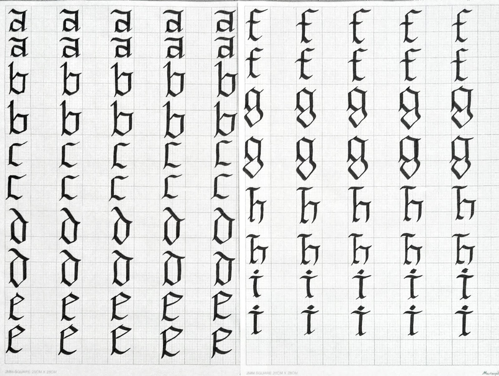
Calligraphy (Week 1)
This week's exercise is using the Artline calligraphy pen 3.0 and draw horizontal, vertical and circular strokes. By practicing regularly, we are able to get used to draw with the pen even more.
 |
| Fig 3.1 1st attempt of vertical, horizontal and circular lines |
 |
| Fig 3.2 2nd attempt of vertical, horizontal and circular lines (Final Outcome) |
Calligraphy (Week 2)
This week's exercise is to start writing in the calligraphy hand that we had chosen. There were uncial, Blackletter, Roundhand, and Chancery hand which was the one that I chose.
 |
| Fig 4.1 Chancery hand |
 |
| Fig 4.2 Chancery hand |
Calligraphy (Week 3)
This week's exercise is to write a sentence consists of few words with the calligraphy hand which we had chosen. I decided to change from Chancery hand to Blackletter hand.
This week's exercise is to write a sentence consists of few words with the calligraphy hand which we had chosen. I decided to change from Chancery hand to Blackletter hand.
 |
| Fig 5.1 1st attempt of Blackletter |
 |
| Fig 5.2 1st attempt of Blackletter |
 |
| Fig 5.3 1st attempt of Blackletter |
 |
| Fig 5.4 2nd attempt of Blackletter (Final Outcome) |
 |
| Fig 5.6 Final Outcome (Graph Paper) |
 |
| Fig 5.5 Final Outcome (A4 paper) |
Lettering (Week 4)
This week's exercise is to create our own lettering which reflects/shows our characteristic.
 |
| Fig 6.1 5 different ideas describing trendy |
 |
| Fig 6.2 Lettering which describes trendy more accurately |
Animated Lettering (Week 5)
This week's exercise is to animate our lettering that reflects our characteristic using Adobe Illustrator and Photoshop. For the lettering exercise, I'm trying to express my name as fashionable(trendy).
 |
| Fig 7.1 Lettering in Adobe Illustrator |
 |
| Fig 7.2 Animated Lettering in Illustrator |
 |
| Fig 7.3 1st attempt of animated lettering |
 |
| Fig 7.4 2nd attempt of animated lettering - Trendy (Final Result) |
This week's exercise is to create 6 type expressions which are sparkle, tall, rage, heavy, blur and float.
 |
| Fig 8.1 1st attempt of type expression |
 |
| Fig 8.2 Final result of 6 type expression |
 |
| Fig 8.3 1st attempt animating rage |
 |
| Fig 8.4 2nd attempt animating rage |
 |
| Fig 8.5 Animating in Adobe Illustrator |
 |
| Fig 8.6 3rd attempt of rage (final result) |
 |
| Fig 8.7 Animating in Adobe Illustrator |
FEEDBACK
Week 1
Mr Vinod said that the overall result was good, however the circular lines needed to be improved by drawing more narrow circles.
Week 2
Mr Shamsul complimented how well I write the Chancery letters and he told me to focus on the alphabets first followed by the spacing.
Week 3
Mr Shamsul commented that the flow of my Black letter writing isn't good that the size of the alphabets isn't constant. He mentioned that I should practice even more.
Week 4
For the calligraphy exercise, Mr Vinod said that the size of the alphabets are too big and the spacing of the letters I wrote aren't right yet. The sentences that I've chosen didn't have the right contrast yet I was advised to choose another one. On the other hand, Mr Vinod and Mr Shamsul agreed that my lettering sketch was expressing "trendy" as in the term of fashionable and it was well done. Hence, Mr Vinod mentioned that we should focus on only one characteristic/personality in the lettering exercise.
Week 5
For the lettering exercise, Mr Vinod agreed on the animation that I saw in Pinterest and he said that if I wanted to do it, I had to do it step by step in a long process by using lots of art boxes. He also gave us advice to use more art boxes so that the result of our animated lettering would look better.
Week 6
Mr Vinod and Mr Shamsul said that my sparkle and float were too static and I needed to make some changes by rotating the words. Additionally, the type expression "blur" wasn't good as well. After some changes, they finally approved all of the type expression and asked me to pick one to animate. I chose the word "rage" and animated it. I showed Mr Shamsul my final result and he said that it was okay as it showed rage, but he added some feedback to enlarge the size of the word "rage" at the end as the word was expanding out of the box. Furthermore, Mr Vinod said that we should start paying attention at how we take pictures for our e-portfolio.
REFLECTION
EXPERIENCES
Week 1
This week's lecture is very interesting that I gain lots of knowledge of Typography. It shows me that Typography isn't just words, however it's more than that. Because of its variation, I want to explore and try the various types.
Week 2
It's very interesting to learn about 4 different types of calligraphy hands. Although it was hard, it was fun at the same time.
Week 3
I had a very hard time to control my hand to get the right flow to write my sentences because my hand wasn't really stable and sometimes the size would get either larger/smaller where it's not constant.
Week 4
I found it very tough to find the right lettering for the exercise because it was really hard to find the right characteristic to express myself.
Week 5
It was very hard for me to animate the lettering because I wasn't sure how to do it with adobe illustrator. However, it was very helpful and fun although a bit annoying.
Week 6
It was a bit stressful when I had to make the 6 type expression because some of the words were a bit too hard.
OBSERVATIONS
Week 1
I observe that we need lots of practice to create the perfect lines and lots of updates and documentation in blogging.
Week 2
I observe that there are some parts of the letterforms that we have to be aware of and as well as the spacing of the letters.
Week 3
I observe that not only do I have trouble with the letterforms, but some people as well. It will take lots of practice to get there.
Week 4
I observe that lots of people have different and interesting lettering based on their characteristic and how they express it.
Week 5
I noticed that everyone had different lettering and they were all really minimalistic.
Week 6
I really like how other classmates work on the type expression. They were different and interesting at the same time.
FINDINGS
Week 1
While I was doing the assignments, I had to control my hand in the pressure and angle in drawing the lines. It was hard at first as I wasn't used to it, however I noticed that I've got better and used to the pen.
Week 2
It was very hard to choose which hand that suits me the best. In the end, I picked Chancery hand and tried to write the alphabets. It was really hard but fun at the same time.
Week 3
It was definitely very risky and challenging to change from Chancery to Blackletter hand. However, I got a bit more comfortable with Blackletter more than Chancery.
Week 4
While I was doing the lettering, I focused a lot that I forgot the time. However, finally I thought of something that was very unusual and new.
Week 5
I was a bit stressed when I was animating the lettering because I wasn't that familiar with it yet.
Week 6
While I was animating my type expression, I was really tired and a bit stressed as I really wanted it to turn out well.
FURTHER READING
Butterick's Practical Typography
Week 1 - Week 2
 |
| Fig 9.1 Book Cover |
Chapter 1 : Letterspacing
Letterspacing is the adjustment of the horizontal white space between the letters in a block of text. Unlike kerning, Letterspacing affects every pair.
Lowercase don't ordinarily need letterpsacing nor do capital letters when they appear at the beginning of a word or sentence. It is because they're designed to fit correctly next to lowercase letters. However, if you use capital letters together, the spacing will look too tight.
https://practicaltypography.com
 |
| Fig 9.2 Letterspacing |
Week 3 - Week 4
 |
| Fig 9.3 Perfect Typeface Combinations : Type Team |
Hierarchy is important because it introduces levels within the text; chapter headings, cross headings, captions and so on; and provides the reader with signposts they need to successfully navigate their way through the layout.
Point size and spacing are layout techniques that help to provide hierarchy, but there are other ways to achieve that which are by paying attention to the weight and form.
The bold and extended weights draw eye to the important information: what, when, where, and website.
Chapter : Size matters
Point size is an expression of the body height of a font rather than the size of glyphs. The body height of this virtual area is constant at every given point size, while the width varies with the width of font's glyphs.
If you set two typefaces together that are the same point size they will appear to be different sizes. However, to pair two or more typefaces in a layout where they need to appear similar sized, you must visually match the x-heights rather than simply set them at the same point size.
Chapter : Serif shapes and bracketing
Serifs can be either bracketed or unbracketed. A bracketed serif transitions in a smooth curve at the point where it joins a stroke, while an unbracketed serif joins the stroke abruptly, often at a right angle.
When using serif shapes as a signpost to a successful typeface combination, think about mood as well as context and practical requirements. Blunt organic serifs work well when used to conjure up a sense of history while sharp wedges can generate energy and give your type a cutting edge feel with a touch of traditional elegance thrown in for good measure.
Week 5 - Week 6
 |
| Fig 9.4 Understanding Typography Concepts |
http://collaborgator.pbworks.com/f/indesign_typography.pdf
Chapter : Serif and San serif text
When designing headings, you can either choose serif or san serif font families. For body text:
When designing headings, you can either choose serif or san serif font families. For body text:
- Serif fonts can be easier to read in print.
- San serif fonts can be easier to read online.
 |
| Fig 9.5 Example of why we need serifs |
A font's baseline is the lowest point of letters except those that extend the baseline such as "y" and "g".
You can use baseline to shift to adjust the baseline for one or more characters, either to create an effect or to format special symbols such as the trademark symbol.
 |
| Fig 9.6 Examples of baseline shift applied |


Comments
Post a Comment