ADVANCED TYPOGRAPHY - EXERCISES
1.04.19 - 30.04.19 (Week 1 - Week 5)
Maydeline (0335392)
Advanced Typography
Exercises
LECTURES
Lecture 1 : MIB / 8 Typographic Systems
09.04.19
We were briefed on the module outline, the upcoming exercises and projects we'll be doing throughout this semester.
Lecture 2 : 8 Typographic Systems
09.04.19
This week, we had a short presentation on our assigned topic which was 8 Typographic Systems consisting of Axial, Radial, Dilatational, Random, Grid, Modular, Bilateral, and Transitional. We were split into groups and here is the compilation of our presentation :
Lecture 3 : -
16.04.19
We have no lecture this week as we continued doing the exercises.
Lecture 4 : Compressed History of Roman Alphabet
23.04.19
Today we had a lecture from our classmates who were presenting about Compressed History of Roman alphabet.
From this presentation, I learned the development letters and how the Romans and Greeks made the letters easier for people today so that is it easier for us to write and understand. In addition, I also gained more knowledge of how pronunciation was developed and how it added vowels to create aesthetics and for people to communicate easily.
Lecture 5 : -
30.04.19
We had no lecture this week.
INSTRUCTIONS
EXERCISES
Exercise 1 : Typographic Systems
01.04.19 (Week 1)
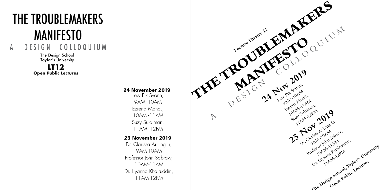
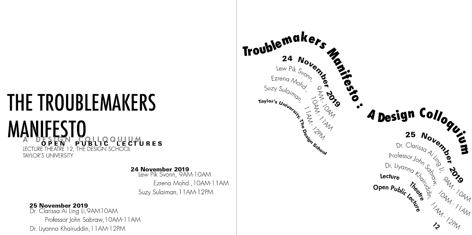
We were tasked to design 2 layouts for each 8 typographic system in Adobe InDesign. The required framework is 200mm x 200mm and the typefaces used were 10 typefaces that were provided by Mr Vinod last semester. We were only allowed to use black and one choice of color and graphical elements such as lines and dots for all layouts.
This is the content for this exercise :
 |
| Fig 1.1 Exercise content |
Before we start digitising them on Adobe InDesign, we were told to sketch the typographic systems beforehand.
 |
| Fig 1.2 Sketches |
 |
| Fig 1.3 Sketches |
09.04.19 (Week 2) - 16.04.19 (Week 3)
After sketching, I started digitising them in InDesign with a chose typeface Futura and used only black. There were a few changes to the layout because some didn't work well digitally.x
 |
| Fig 1.4 Axial System (1st attempt) |
 |
| Fig 1.5 Modular System (1st attempt) |
 |
| Fig 1.6 Grid System (1st attempt) |
 |
| Fig 1.7 Bilateral System (1st attempt) |
 |
| Fig 1.8 Random System (1st attempt) |
 |
| Fig 1.9 Dilatational System (1st attempt) |
 |
| Fig 1.10 Radial System (1st attempt) |
 |
| Fig 1.11 Transitional system (1st attempt) |
After receiving feedbacks, I did some arrangements and a bit changes in some systems. I also changed Modular and Random.
 |
| Fig 1.12 Axial system (2nd attempt) |
 |
| Fig 1.13 Grid system (2nd attempt) |
 |
| Fig 1.14 Bilateral System (2nd attempt) |
 |
| Fig 1.15 Transitional System (2nd attempt) |
 |
| Fig 1.16 Random System(2nd attempt) |
 |
| Fig 1.17 Modular System (2nd attempt) |
Fig 1.18 2nd attempt of Typographic Systems (Spreads)
23.03.19 (Week 4)
Mr Vinod said that overall my systems are generally good but he pointed out some mistakes in transitional and dilatational. I did some changes on them.
 |
| Fig 1.19 Transitional system 3rd attempt |
 |
| Fig 1.20 Dilatational system 3rd attempt |
Here is the final result of the 8 typographic systems. From top to Bottom : Axial, Modular, Grid, Bilateral, Random, Dilatational, Radial, Transitional.
 |
| Fig 1.21 Axial System (Final) |
 |
| Fig 1.22 Axial System (Final) |
 |
| Fig 1.23 Modular System (Final) |
 |
| Fig 1.24 Modular System (Final) |
 |
| Fig 1.25 Grid System (Final) |
 |
| Fig 1.26 Grid System (Final) |
 |
| Fig 1.27 Bilateral System (Final) |
 |
| Fig 1.28 Bilateral System (Final) |
 |
| Fig 1.29 Random System (Final) |
 |
| Fig 1.30 Random System (Final) |
 |
| Fig 1.31 Dilatational System (Final) |
 |
| Fig 1.32 Dilatational System (Final) |
 |
| Fig 1.33 Radial System (Final) |
 |
| Fig 1.34 Radial System (Final) |
 |
| Fig 1.35 Transitional System (Final) |
 |
| Fig 1.36 Transitional System (Final) |
 |
| Fig 1.37 Thumbnail (Final) |
 |
| Fig 1.38 Thumbnail (Final) |
Fig 1.39 Final Result of Typographic Systems (Pages)
Fig 1.40 Final Result of Typographic Systems (Spreads)
Type & Play : Part 1
16.04.19 (Week 3) - 23.03.19 (Week 4)
We were briefed on our next exercise called type and play part 1 where we were tasked to select a photo which could be man-made, nature or building structures. We had to trace the structure using lines or shapes. Firstly, we had to analyse, dissect and identify 5 letterforms. I took several photos and tried several attempts. Firstly, I tried to analyse and dissect the picture of the building that is very geometrical and has lots of lines.
 |
| Fig 2.1 Picture of building |
 |
| Fig 2.2 Dissecting and analysing |
 |
| Fig 2.3 Letter D, A, H, V, E that were found |
After receiving feedback from Mr Vinod and Mr Shamsul, it seems that I didn't dissect correctly so I decided to trace again and dissect it properly.
 |
| Fig 2.4 Process of tracing |
I started identifying the letters and highlighting them black.
 |
Fig 2.5 Letterforms found (M, H, A, V, L, C)
|
 |
| Fig 2.6 Letterforms found |
 |
| Fig 2.7 Refined letterforms (1st attempt) |
 |
Fig 2.8 Reference (Geometric Typeface by Fatema Yousef) |
 |
| Fig 2.16 2nd attempt of refining |
 |
| Fig 2.9 3rd attempt of refining and characteristic |
Both lecturers agreed that the diagonal is too much and I should decrease it. Some of the letters such as A and M are quite awkward so they gave me few suggestions to maintain the characteristics. Here is another attempt of refining letters. I chose Gill Sans Std Bold as a reference for my letters.
 |
| Fig 2.10 Reference (Gill Sans Std Bold) |
 |
| Fig 2.11 4th attempt of refining |
Mr Shamsul said that it's not consistent and still the A and M are very awkward. He gave me suggestion of making everything diagonal so I tried to do that.
 |
| Fig 2.12 Letterforms refined with guidelines |
 |
| Fig 2.13 Final result of refined letters |
Fig 2.14 Embedded PDF of Type & Play pt 1 (Final Result)
Fig 2.15 Embedded PDF of Type & Play pt 1 (Final Result)
Type & Play Pt 2
30.04.19
This next exercise, we were tasked to choose a photo which could be man-made objects, buildings, nature or even humans. After choosing an image, we had to create an interplay between typography and the image. Here are some references that were given.
 |
| Fig 3.1 Reference |
 |
| Fig 3.2 Reference |
At first I wanted to use a person doing an advanced yoga pose, but since it's too static, I decided to look for another photography that has dynamic poses. I searched for images about a person dancing in the internet.
 |
| Fig 3.4 Image for exercise |
 |
| Fig 3.5 1st attempt |
After receiving the feedback, the interplay between the text and image is appropriate but it's not exciting or noteworthy. I took the feedback and tried to experiment to make it exciting but I tried to choose another image and also search more reference.
 |
| Fig 3.6 Reference |
I really like the interplay on those posters so I took that as a reference and tried to make another attempt using this image below.
 |
| Fig 3.7 2nd image |
 |
| Fig 3.8 2nd attempt |
As I kept examining, I felt that the font that I used were too simple and I wanted to change them into serif because ballet is very elegant and graceful and serif shows that characteristic as well so I tried to go with Bembo and see how it will look and compare.
 |
Fig 3.9 Comparison of Serif and Sans Serif (3rd attempt)
|
 |
| Fig 3.10 Final Outcome Type & Play pt 2 |
Fig 3.11 Embedded PDF Final Outcome Type & Play pt 2
FEEDBACK
Week 2
General Feedback : Mr Vinod gave us feedback about our presentation where he pointed out to always give eye contact to the audience when we're presenting. Never be afraid to ask question and always be reminded the placement of our text in the slides. For our typographic system exercise, we have to remember the informational hierarchy is important.
Specific Feedback : Mr Vinod and Mr Shamsul said that the grid, random, dilatational, bilateral, transitional and axial were alright but needed to be more tidy. In addition, I needed to fix the spacing and kerning of the text. They gave me suggestions for certain systems such as radial and modular. Overall, needed more adjustment and changes and therefore they reminded me not to use graphic elements first.
Week 3
Specific Feedback : For typographic system exercise, Mr Shamsul said that overall all of the systems are good but axial seems a bit weird because it has lots of direction but interesting. After showing Mr Vinod my thumbnail, he said that dilatational, radial, axial are good. For bilateral, fix the paragraph spacing and also the contrast is too much but both are okay, same goes to grid. He suggested me how to do modular system correctly because mine looks like grid. For transitional, he mentioned that I could make the words more curved to have that flow. In addition, for random, I'm almost there but Mr Vinod suggested me to go more random and also pointed out for the point size of the time to be reduced 0.5pt and not to use Serif and Sans Serif together.
Week 4
Specific Feedback : Mr Vinod said all are generally good, but he pointed out that one of my dilatational looks like an oval rather than a circle whereas I had to make it more circular. In addition, for transitional, there is a small mistake for "Lecture Theatre 12" as it's not readable so I need to adjust that part. For my e-portfolio, Mr Shmasul pointed out to include my thumbnails and sketches, the rest are good and fine.
Week 5
General Feedback : Mr Vinod told us to refer at the typefaces that look similar to our traces and work by looking at it.
Specific Feedback : For exercise type and play pt 1, my dissecting and refining part is correct but I should refine more by reducing the amount of diagonal. Mr Shamsul and Mr Vinod gave me several suggestions and reminded me to make all the letters look same and consistent.
Online Feedback : The interplay between image and text is appropriate but not surprising or noteworthy. For it to be noteworthy, it needs to have more exciting and surprising interplay between text and image. Currently it's at B- level. Needs to be more exciting and surprising. (Exercise Type and Play pt 2)
Letterforms seem to be done I think. I don't remember the original source and the refinement steps taken so I can't say for sure. (Exercise Type and Play pt 1)
Yes, it's getting there.
REFLECTION
EXPERIENCES
Week 1
I had a hard time sketching the 8 typographic systems, there were lots of trials to reach the final sketch. Therefore, it was a tough journey of sketching that I had to look for lots of references to guide me.
Week 2
I find the feedback from the lecturers very effective as it really helped me to understand more about the typographic systems as I'm still confused with some of the systems.
Week 3
I had a hard time completing the modular system because I was confused as how it's supposed to be but with the help of the lecturers and classmates, I have understand how to do it correctly.
Week 4
I was actually very confused and lost when I was doing the type and play exercise part 1 where I had to find letters from an image, that was tough. However, as I was finding them, I must say it was fun identifying letters from building but definitely it took quite a long time to get there.
Week 5
I had a hard time choosing an image because I had to think the quotes or words that could go well with the image. In addition, I was also lost on how to create an interesting and dynamic interplay this is where I had to do lots of research and experiment.
OBSERVATIONS
Week 1
I observed that I had to see lots of references to help in designing the layouts to apply the systems correctly and there are many different and unique ways to design the systems.
Week 2
I observed that most people tend to go for the clean minimal look with white background and everyone has different design ways of expressing the information which was really interesting to look at.
Week 3
I observed that many people had troubles doing modular system because it is very similar to grid system but everyone succeeded after hearing the lecturers method of doing modular.
Week 4
I observed that everyone has different objects they choose to find the letters, they were really interesting because I wasn't expecting that the result would be that good. In addition, designers who had also done something similar to this, their outcome were amazing.
Week 5
Viewing my first attempt, it looks like it's too simple and general and I had to make it better and be more creative. When I looked at my classmates' works, they have different image and text that they wanted to do for the exercise.
FINDINGS
Week 1
I found that there are lots of ways for designers to create unique designs using typographic system to make visually stand out.
Week 2
I found out that modular system could be done using a grid first and the lecturers taught me how to use the grid properly.
Week 3
I found out that paragraph spacing and leading play major roles because it helps for readability and also it makes the body text look visually not so cramped.
Week 4
I found out that it takes a long time to get the final outcome of the refined letters but we could create interesting outcome of typeface from any objects in the nature if we keep studying and experimenting the objects.
Week 5
I found out that every designers have different style and preference to make the interplay between image and text interesting. There were lots of examples in Pinterest and I liked how they really did the interplay between the text and the person, it was very interesting.
FURTHER READINGS
Typographic Systems of Design by Kimberly Elam
Week 1
 |
| Fig 3.1 Typographic Systems |
Chapter : Modular System
Modular system is unlike other systems, it involves nonobjective elements in all compositions, even the one size, one weight thumbnails. Modules take the place of nonobjective elements, and the designer is challenged to design which modular shapes at the outset. Simple shapes such as circle, square, and rectangle are the easiest to control with long rectangles having the closest visual relationship to lines of text. Polygons, ellipses, and other multifaceted shapes become very complex and are much more difficult to control.
Here are some examples of modular system :
 |
Fig 3.2 Examples of modular system
|
Typographic Design : Form & Communication by Rob Carter, Ben Day & Philip Meggs
Week 2
 |
| Fig 3.3 Typographic Design Book |
Chapter : Visual Hierarchy
When creating a visual hierarchy in typographic space, a designer balances the need for harmony, which unifies a design, with the need for contrast, which lends vitality and emphasis. As in music, elements can have a counterpart or a counterpoint relationship. Typographic counterparts are elements with similar qualities that bring harmony to their spatial relationship. Elements have a counterpoint relationship when they have contrasting characteristics, such as size, weight, color, tone, or texture. Counterpoint relationships bring opposition and dissonance to the design.
Contrast between elements within the space is achieved by carefully considering their visual properties. Important contrasts used to create hierarchical arrangements include size, weight, color, and spatial interval. The location of an element within the space plays and important role in establishing a visual hierarchy. The spatial relationships with other elements can also influence an element's relative importance in the arrangement.
 |
| Fig 3.4 Visual Hierarchy that shows unity and rhythm |
 |
| Fig 3.5 Size and position of arrows that show visual hierarchy |
Thinking With Type
Week 3
 |
| Fig 3.6 Thinking with type book |
Chapter : Letters
When I read this book, I found this content discussing about letters in this book. There are some examples of designing typeface/ letters on a grid of squares or a grid of dots. Substitute curves and diagonals of traditional letterforms with gridded and rectilinear elements. Avoid making detailed staircases, which are just curves and diagonals in disguise.
 |
| Fig 3.7 Examples of letters made by designers |
 |
| Fig 3.8 Examples of letters made by designers |
 |
| Fig 3.9 Examples of letters made by designers |
The 3D Type Book
Week 4
 |
| Fig 3.10 Book Cover |
When I found this book and read it, I would describe it as mind-blowing. This book is very helpful as it consists of various of letters found in nature even in humans and I must say the results are amazing.
They are very unique and now I get it why design isn't just about pens and papers and screens, they can even come from everyday objects which we don't even notice that often. This book gives me tons of examples which really help me during the exercise of finding type. I even started to analyse buildings more and see if I could find any letters from them. Here are some examples that were given:
 |
| Fig 3.11 Examples |
 |
| Fig 3.12 Examples |
 |
| Fig 3.13 Examples |
 |
| Fig 3.14 Examples |
Typographic Design : Form and Communication
Week 5
 |
| Fig 3.15 Book Cover |
Chapter : Type size, line length and interline spacing
Critical to spacial harmony and legibility is an understanding of the triadic relationship of type size, line length and interline spacing. When properly employed, these variables can improve to legibility of even poorly design letterforms, or enhance the legibility of those forms considered highly legible.
Small type reduces visibility by destroying counter forms, which affect word recognition, while large type can force a reader to perceive type in section rather than as a whole. According to legibility research, the most legible sizes of text type at normal reading distances range from 9 to 12 pt. When typefaces of the same point size are places side by side, they may appear to be different sizes because their x-heights vary radically. This is important to keep in mind when selecting typefaces and sizes.
An appropriate line length is essential for achieving a pleasant reading rhythm, allowing a reader to relax and concentrate on the content of the words. Excess energy is expended when reading long lines and it is difficult to find the next line. When working with the optimum sizes of 9-,10-,11- and 12-point text type, a maximum of ten to twelve words per line would be acceptable. This would be equal a line length of approximately 18 to 24 picas. An optimum line length for the average 10 point type is 19 picas.
Typefaces with larger x-heights and need more interline spacing than those will smaller x-heights. Optical adjustments is display types should be made when spaces between lines appear inconsistent because of ascenders and descenders. The maximum line length for text type with a small x-height used without interline spacing is about 65 characters. When text type with a large x-height is used without interline spacing, legibility is diminished when line length exceeds about 52 characters
 1.04.19 - 30.04.19 (Week 1 - Week 5)


Comments
Post a Comment