DESIGN PRINCIPLES - EXERCISES & PROJECTS
27.08.18 - (Week 1 - Week 14)
Maydeline (0335392)
Design Principles
Exercises & Projects
INSTRUCTIONS
Lecture 1 : Module Briefing/ Contrast
27.08.18
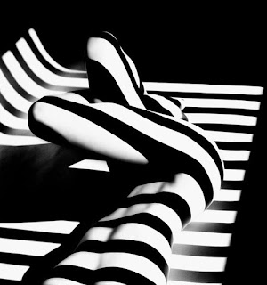
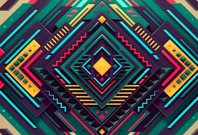
We began our class with an introduction of the module of our upcoming activities and our first lecture, Contrast, a difference which could be spotted in a comparison between 2 or more things. The goal in contrast is to grab the viewer's attention. It is often spotted in brochures, posters and other media.
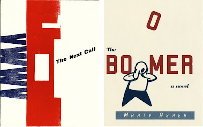 |
| Fig 1.1 Example of contrast |
After the lecture, we were given an assignment and materials related to contrast. We are given the choice to draw with pens, pencils and A4 sketchbook. Our task is to create a contrast between things that are black and white. We were free to choose any theme that we wanted.
I decided to make 2 different artworks that showed contrast. One of them is a drawing of a girl wearing a sunglasses, where the sunglasses were filled with straight and diagonal stripes. I chose this idea because I was thinking of a unique sunglasses. For the cross on the mouth area was added because I gained lots of opinions and feedbacks that I should draw a simple box or cross instead of drawing a realistic mouth. For this drawing, I used black pens to fill the parts black.
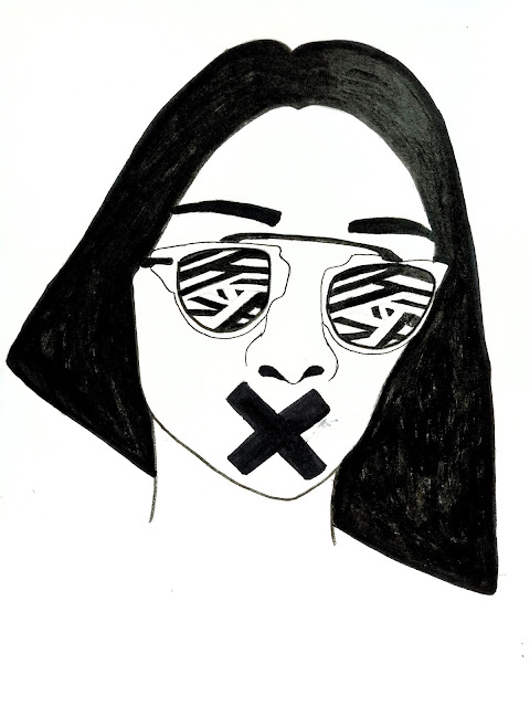 |
| Fig 1.2 1st attempt of contrast |
 |
| Fig 1.3 2nd attempt of contrast (Final result) |
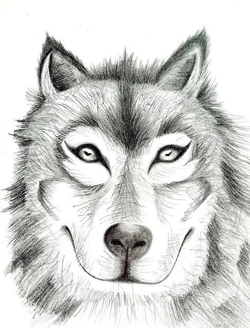
Apart from the first one, I decided to make another drawing that represents contrast but in a different way. I took this inspiration from a friend who had a tattoo of a wolf which I found really cool and artistic. I looked up at some references and decided to draw a realistic version where I focused more on the texture of the fur and the contrast was all on the eyes. Although it was a wolf, I would say that it looked like a mixture of a dog and a wolf. I used pencils ranged from 2H to 9B to create different lines and colours.
FEEDBACK
I was relieved that Ms Sherry was satisfied with my creations and how I manage to create 2 distinctively different kinds of contrast. She was also pleased to see the details of the fur of the wolf. Hence, one of my classmates named Serena was also complimenting the contrast of the drawing of the wolf.
Lecture 2 : Gestalt Principles
04.08.18
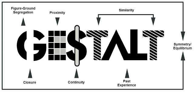 |
| Fig 1.4 Types of gestalt |
Gestalt is a psychology term which means "unified whole". Gestalt principles attempt to describe how people tend to organise visual elements into groups or unified wholes when certain principles are applied. These principles are:
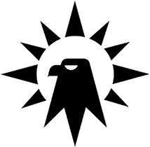 |
| Fig 2.1 Similarity |
Similarity
Unity occurs because the triangular shapes at the bottom of the eagle symbol look similar to the shapes that form the sunburst.
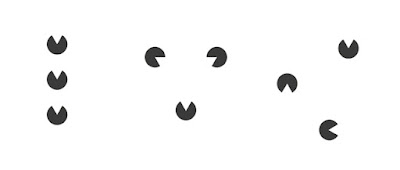
 |
| Fig 2.2 Proximity |
Proximity
When the squares are given close proximity, unity occurs. While they continue to be separate shapes, they are now perceived as one group.
 |
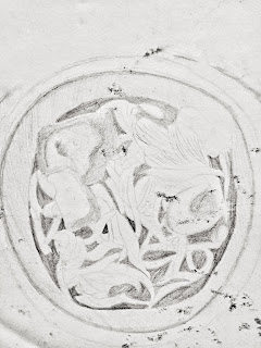
| Fig 2.3 Closure |
Closure
Closure occurs when an object is incomplete or a space is not completely enclosed.
Although the panda is not complete, enough is present for the eye to complete the shape. When the viewer's perception completes a shape, closure occurs.
 |
| Fig 2.4 Continuation |
Continuation
Continuation occurs when the eye is compelled to move through one object and continue to another object.
From this USA network logo, the eye is lead from the u through the s into the a.
 |
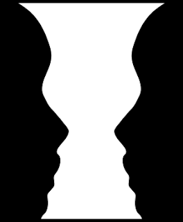
| Fig 2.5 Figure and Ground |
Figure & Ground
The eye differentiates an object form its surrounding area. A shape is naturally perceived is figure and the surrounding is ground. If we view from the white areas, we can spot the 2 faces facing each other. On the other hand, there's a trophy in the black area.
I decided to make something that represents Figure and Ground. At first I did 2 couples holding hands and in the middle it symbolises a heart.
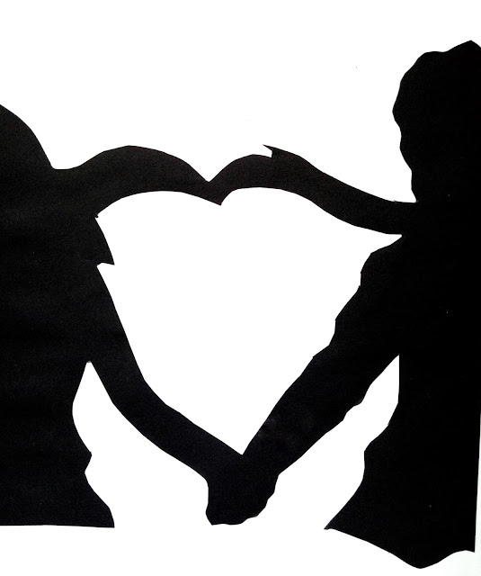 |
| Fig 2.6 1st attempt of gestalt |
FEEDBACK
Ms Anis stated that it was too rough and it wasn't a good result of Gestalt but it was an attempt. On the other hand, Ms Sherry mentioned that it wasn't Gestalt and she couldn't really see it.
I decided to take the feedback and created another better one. After few days of thinking, I was looking at jaguars and was thinking of a jaguar eating a deer which sounded really weird. I tried executing it by drawing the deer's head inside the jaguar's head.
 |
| Fig 2.7 Sketches for gestalt |
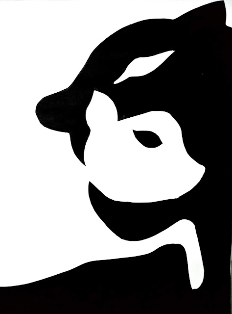 |
| Fig 2.8 2nd attempt of gestalt |
FEEDBACK
We did a critique with some of the students that needed to show their works as well. Ms Sherry said that she could see the panther and the bambi. It's a relief that other students could see as well. Overall, it was a gestalt. Additionally, Ms Anis couldn't see the figure of the Bambi and panther until I mentioned it to her. She gave a feedback that I should relocate the head of the Bambi or maybe change the size of it.
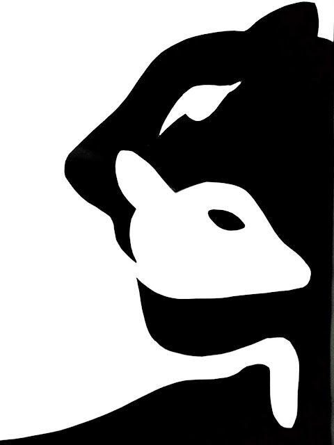 |
| Fig 2.9 Final result of gestalt |
Lecture 3 : Symmetry, Asymmetry, Balance, Dominance
11.09.18
For this week's lecture, we were divided into groups to make presentation of different subjects. For this week's lecture, it was brought by fellow classmates.
 |
| Fig 3.1 Symmetry and Asymmetry |
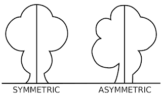
Symmetry
Symmetry is when elements are arranged in the same way on both sides of an axis.
 |
| Fig 3.2 Example of Symmetry |
Asymmetry
Asymmetry is the absence of symmetry. In a single from asymmetry implies a lack of balance, however a compositional balance can be achieved that is asymmetrical.
 |
| Fig 3.3 Example of Asymmetry |
Balance & Dominance
Balance is equality in weight, attention, or attraction of the various elements to accomplish organic unity. On the other hand, dominance is the visual organisation where certain elements should assume more importance than others in the same composition.
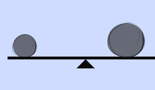 |
| Fig 3.5 Balance |
 |
| Fig 3.6 Dominance |
I decided to make something that represents symmetry. I was inspired by the adventurous instagram traveler who posted a picture of the beautiful scenery which I thought was symmetry. I decided to watercolour that scenery.
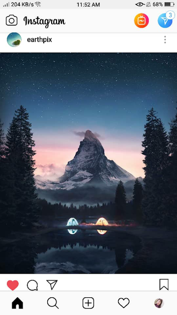 |
Fig 3.7 Idea for symmetry
|
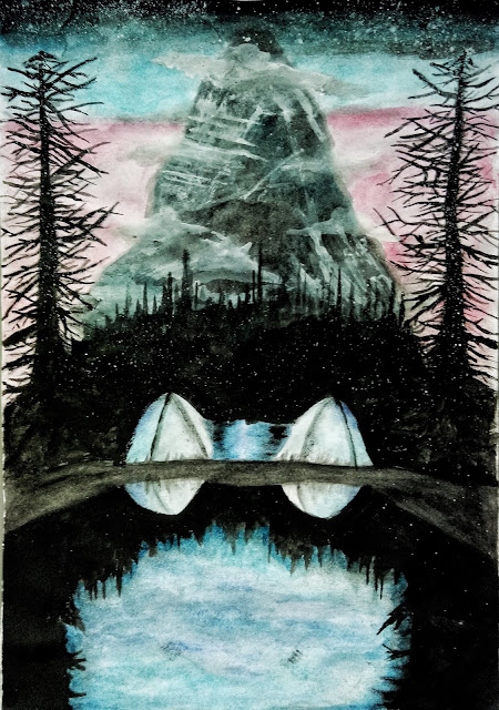 |
| Fig 3.8 Final result for symmetry |
FEEDBACK
Ms Sherry said that the overall result was good and she could really notice that I had the most fun time doing this.
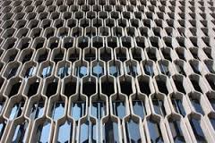
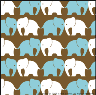
Lecture 4: Pattern, Texture, Repetition, Surface
18.09.18
Repetition
Repetition is simply repeating a single element many times in a design.
 |
| Fig 4.1 Repetition |
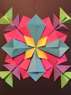
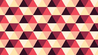
Pattern
Patterns are simply a repetition of more than one design element working in concert with each other to form a whole.
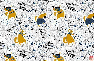 |
| Fig 4.2 Pattern |
Four general types of pattern :
-Branching: Obvious form of patterning in the plant world.
-Spiral: Can be seen from the scale of galaxies to the opening "fiddlehead" buds of ferns, to forms of microscopic animals.
-Flow: Follows the path of the least resistance.
-Packing and Cracking:Refers to the way in which compacted cells define each others shape.
Surface
Surface is any type of artwork (pattern, illustrations, hand lettering, etc) made by a designer that is intended to be applied to a surface to enhance its visual appearance and/or functionally.
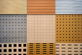 |
| Fig 4.3 Surface |
I decided to make coconuts and leaves pattern with watercolour because I really like food and I feel like drawing coconuts. When I was doing with the watercolour, instead of making it fully white and brown, I put some grey color to make some depth on the coconuts. Hence, I also made feathers with a graduation of purple and blue colours.
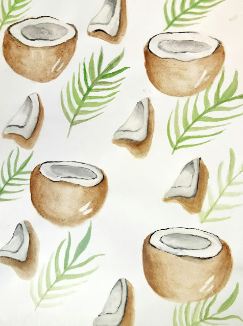 |
Fig 4.4 1st attempt of pattern (Final result of pattern)
|
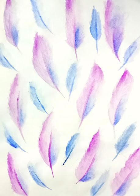 |
Fig 4.5 2nd attempt of pattern
|
FEEDBACK
Ms Sherry said that I didn't follow her direction which was using any materials and print on the paper, instead I used watercolour. However, she said that both of the works that I've made were both patterns and they were good. Additionally, my group partner named Chiquita said that she really likes the coconut and leaves pattern and the colour of the 2nd artwork.
Lecture 5: Alignment, Visual hierarchy, Visual direction
27.08.18
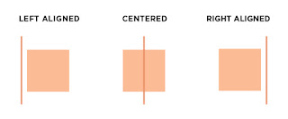
Alignment is the arrangement of visual elements so they line up in a composition. There are 3 types of alignment:
 |
| Fig 5.1 Alignment |
 |
| Fig 5.2 Center and edge alignment |
Edge alignment: the arrangement is at the edges of the page/canvas.
Centre alignment: elements are aligned to the centre.
Visual Optical alignment: something that designers use to fix the alignment.
Visual Hierarchy is the arrangement/presentation of elements in a way that implies importance.
Scale: to make things stand out
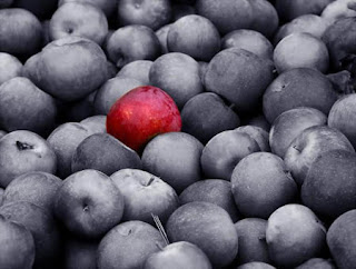
Color and contrast: objects that are different than their surroundings to catch the viewers' attention.
White space
Proximity: nearness to an eye-catching element.
Placement: the change and position of shapes/objects that can affect the visual depth and composition of artwork.
 |
| Fig 5.3 Example using visual hierarchy |
Visual Direction is leading the eye to next location if it was in a motion.
Horizontal direction : calm and stable
Vertical direction: formality, alertness, balance
Diagonal direction: movement and action
 |
| Fig 5.3 Example of Alignment |
For the collage exercise, I decided to cut some parts I found interesting in a magazine that I had. I wanted to keep it minimalistic and add more contrast
with typography. To keep it minimalistic, I put more black and white photos and I put some colourful
elements to contrast.
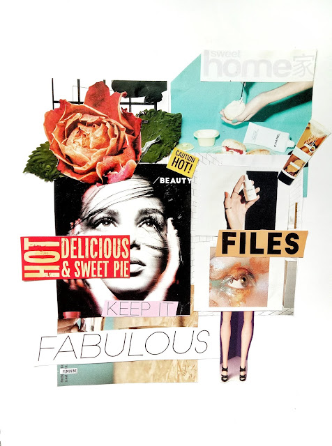 |
Fig 5.4 Final Result Collage
|
FEEDBACK
We did a critique session with the whole class where Ms Sherry saw my collage and she stated that she really liked the overall result of it however it wasn't really placed at the centre when I was actually going for centre alignment. However, she said that she could spot rhythm in the collage because of the typography.
Lecture 6: Dot, Line, Size, Scale
02.09.18
Dot
The smallest and most basic element of graphic design. Designing with dots can create a wide variety of visual effects.
 |
| Fig 6.1 Dot Design |
A single point in the center of an area can convey calmness. On the other hand, if a dot is at the edge of the paper, it will convey tension.
2 dots implies
a structure.
Repetition of dots creates textures.
Dots in combination can imply direction, movement and lines.
Line
 |
| Fig 6.2 Example of line design |
 |
| Fig 6.3 Example of line design |
 |
| Fig 6.4 Line design poster |
Size
How big or small an element is in relation to other object. Size is used in design to convey important, attract attention and create contrast.
 |
Fig 6.5 Example for size
|
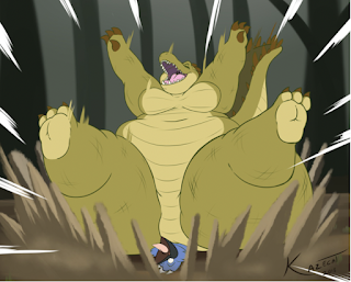 |
Fig 6.6 Example for size
|
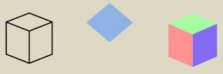
Scale
Scale refers to the size of an object in relationship to other object. In art the size relationship between an object and the size human body is significant. In experiencing the scale of an artwork we tend to compare its size to the size of our own bodies.
Scale creates emphasis, drama and aids hierarchy.
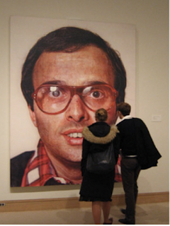 |
| Fig 6.7 Painting by Chuck Close (Example of scale) |
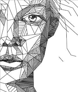
I decided to make an artwork which uses line design but I also wanted to make some parts that has watercolour in it. I had an idea to make a drawing of a portrait of a girl. Instead of drawing the full face, I decided to make half of the face with her eyes, eyebrows, hair and the other half would be 6 or more different lines. My goal is to make the artwork portrays how tired I am with all of the assignments. To portray that, I made the hair grey instead of black, the mouth completely shut which portrays how silent I am when I'm doing my work, but a half part of me is still alive.
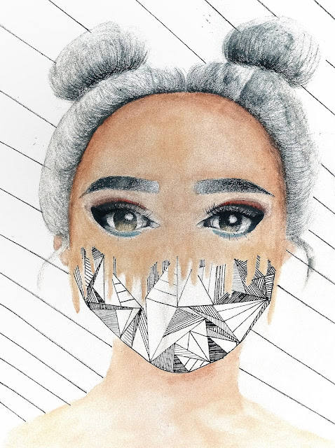 |
| Fig 6.8 Final result of line design |
FEEDBACK
Ms Sherry asked me about the story and after I've explained it she said that the story was interesting and she likes the result. However, the only thing she wasn't a fan of the was the background where I put some lines.
Lecture 7: RHTYHM, MOVEMENT, HARMONY
09.10.18
Harmony
 |
| Fig 7.1 Example of Harmony |
Harmony is the belonging of one thing with another, repetition of color, texture, shape, form, unity variety. There are 2 types of harmony:
Visual harmony
An artwork is unified by color, shapes, textures, composition or some other visual design principle.
 |
| Fig 7.2 Example of visual harmony |
Conceptual harmony
An artwork uses a theme/concept.
 |
| Fig 7.3 Example of conceptual harmony |
Movement
Path of the viewer's eye takes through the work of art
 |
| Fig 7.4 Example of movement |
There are 2 types of movement:
Movement through action
It makes the painting becomes more alive.
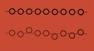
Movement in repetition and rhythm
To create a rhythm
Rhythm
 |
| Fig 7.5 Example of rhythm |
Regular Rhythm
 |
| Fig 7.6 Example of Regular rhythm |
Progressive rhythm
 |
| Fig 7.8 Example of Progressive rhythm |
Alternating rhythm
 |
| Fig 7.9 Example of Alternating Rhythm |
Random Rhythm
 |
| Fig 7.10 Example of Random Rhythm |
During the weekends, I spotted a water fountain in front of the mall which captured my attention. It was during the evening where the illuminated lights reflect the water fountain. I took this photo because I immediately could identify design principles such as movement, rhythm and repetition as I'm also a fan of photography of water movement. I decided to edit this picture a bit so that it would really highlight the color and give more contrast to it.
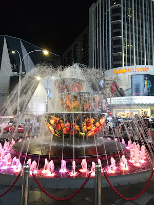 |
| Fig 7.11 Photography of water fountain |
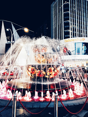 |
| Fig 7.12 Edit of the photography |
 |
| Fig 7.13 Final result of photography |
FEEDBACK
Ms Sherry saw my work and she said that she likes the picture that she could identify lots of design principles such as rhythm, repetition and movement. Overall, she stated that it was a good job.
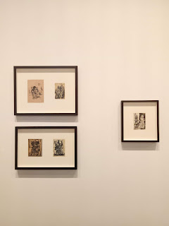
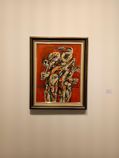
A Visit to Ilham Gallery
11.10.18
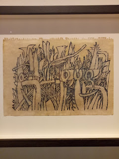
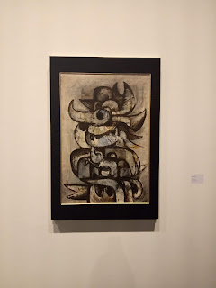
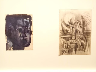
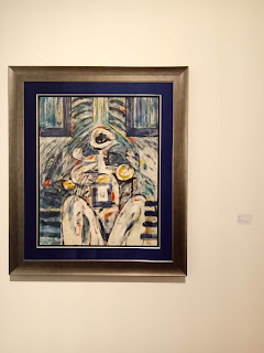
We also went to an art gallery called ILHAM Gallery which is located in Kuala Lumpur. The gallery was open for public and everyone was welcome to see a Southeast asian designer's artwork. Although the place was far from the university, it was definitely a fun and different experience as we got to have a chance to see other people's works and it would give us inspiration or ideas. The building was really aesthetic and modern or I would describe it as a fancy place.
When we visited the gallery, it was an exhibition of Latin Mohidin's artworks which he named "Pago Pago". Latin Mohidin is a Malaysian painter and poet. Furthermore, his work Pago Pago portrays a formative period of the artist's art during 1960s as he traveled across Europe and Southeast Asia. By looking at his artworks, I could really see his journey. Additionally, some of his artworks were difficult to understand but they were really interesting because of the uniqueness of his art.
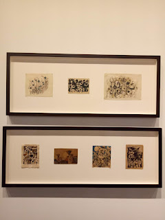 |
| Fig 7.14 Painting |
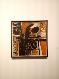 |
| Fig 7.15 Painting |
 |
| Fig 7.16 Painting |
 |
| Fig 7.17 Painting |
 |
| Fig 7.18 Painting |
 |
| Fig 7.19 Painting |
 |
| Fig 7.20 Painting |
 |
| Fig 7.21 Painting |
Lecture 8: Figure and Ground, Shapes and Form
18.10.18
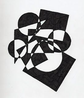
Figure and Ground
Figure is foreground and ground is background. There are different kinds of figure and ground such as blur, size and contrast.
 |
| Fig 8.1 Gestalt Figure and Ground |
 |
| Fig 8.2 Blur figure and ground |
Shapes
Shapes can be describes as lines, space, colour. Shapes can be both objective and non-objective abstract as they also help the drawing to look more realistic/naturalistic.
 |
| Fig 8.3 Example of shapes |
 |
| Fig 8.4 Example of shapes |
Form
Form gives dimension, volume, texture and space. They can be created using lines, tones or colour.
 |
| Fig 8.5 Forms |
 |
| Fig 8.6 Examples of forms |
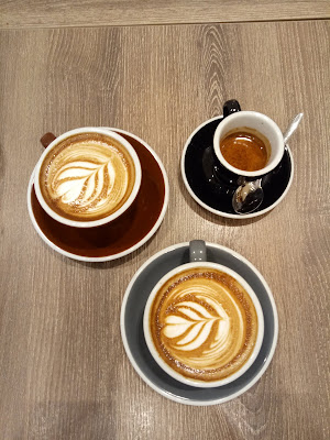
I like to have a light meal at night after dinner where I always have a donut and a cup of coffee at Starbucks. It gave me an idea and I decided to illustrate donuts as they had circular shapes and of course the cups of coffee. To add some fun, I played on the color so that all of them match.
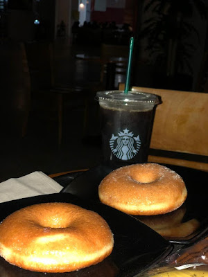 |
| Fig 8.7 Photography of my idea |
 |
| Fig 8.8 Photography for my idea |
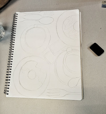 |
| Fig 8.9 Sketches |
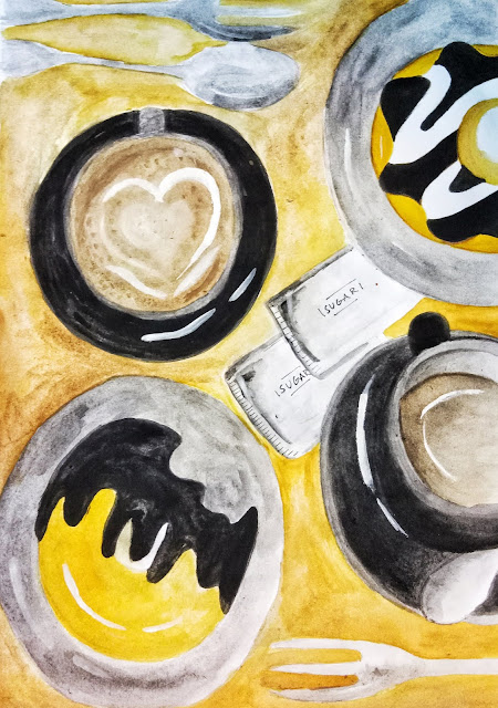 |
| Fig 8.10 Final result of shapes |
FEEDBACK
Ms Sherry likes how I match the colours such as brown, yellow, grey and chocolate. However, she was shocked when the topping was black. In addition, she likes how I draw and color the sugar packaging.
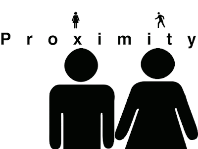
Lecture 9 : Proximity, Proportion, Perspective, Unity/Variety
25.10.18
Proximity
Grouping and shaping of objects in a composition to create and dispel connections. Proximity can be seen by moving visual elements closer together or further apart. These two forces can be applied in various degrees to help achieve a particular effect or outcome to communicate a message. A clear visual hierarchy also stands out on the page. Proximity in influential to hierarchy and balance in design principles.
 |
| Fig 9.1 Examples of Proximity |
 |
| Fig 9.2 Examples of proximity |
The main purpose of proximity is to organise information. It's the relationship or lack of relationship between shapes that can trigger feelings, convey messages, engage an audience, add emphasis to a portion of the layout and create dynamics.
Perspective
Perspective is used to represent three-diemensional objects on a two-dimensional surface in a way that looks natural and realistic. It can create illusion of space and depth on a flat surface.
 |
| Fig 9.3 Example of Perspective |
Atmospheric perspective
 |
| Fig 9.4 Atmospheric Perspective |
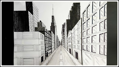
Linear perspective
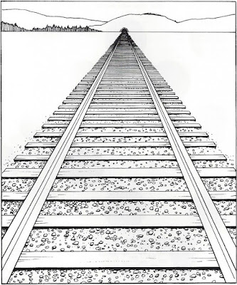 |
| Fig 9.5 Linear Perspective |
One-point perspective
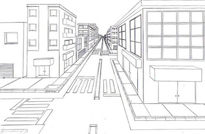 |
| Fig 9.6 One-point Perspective |
Two-point perspective
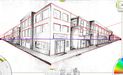 |
| Fig 9.7 Two-point Perspective |
Three-point perspective
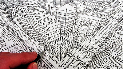 |
| Fig 9.8 Three-point Perspective |
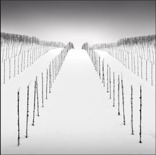
Proportion
The harmonious relationship between 2 or more elements that work well together in a composition where not a single element is too dominant/ineffectual. Proportion helps create unity and harmony in design. Good proportion adds harmony, symmetry balance.
 |
| Fig 9.9 Example of Proportion Poster |
There are some ways artists use to calculate proportion:
Face proportion
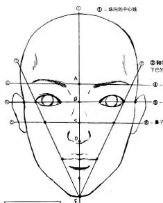 |
| Fig 9.10 Face Proportion |
Golden Ratio
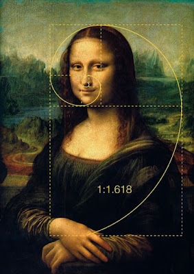 |
| Fig 9.11 Golden Ratio on Painting |
Unity/Variety
Unity in an artwork creates a sense of harmony and wholeness, by using similar elements within the composition and placing them in a way that brings them all together.
 |
| Fig 9.12 Example of Unity |
 |
| Fig 9.13 Example of Variety |
I remembered that I had a memorable picture which was my favourite out of all. I took this picture few years ago when I traveled to Turkey. I traveled to lots of cities but I found this path and trees in Pamukkale which was near Cannakale. I was wandering around the city as I wanted to find some quiet places that tourists won't go to and found it. I immediately took a picture of it even though it didn't represent Turkey but I thought that it was really nice. I like how the color of the sky is blue and although the trees are not full as they are trimmed as some of the parts are gone, I like them a lot.
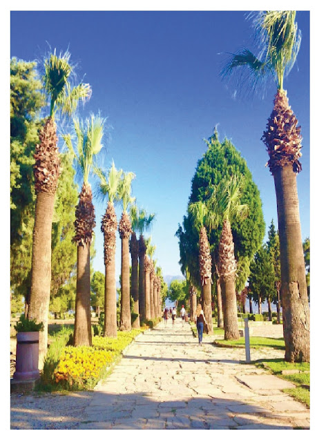 |
| Fig 9.14 Final result of Perspective |
FEEDBACK
Ms Sherry commented that I got the idea of perspective and it was a really nice photography. She was also interested in where I took this picture and the cities in Turkey I traveled to.
Project 1 : Self Potrait
09.10.18 - 30.10.18 (Week 7 - Week 9)
INSTRUCTIONS
For this project, we were instructed to do our self portrait for project 1. We were given a length time of 2 weeks to do it. Hence, we were free to use any medias that we desired to create our self portrait. Ms Sherry showed us some examples from famous painters and the works brought inspiration that I decided to focus more on realistic painting. I chose this picture of myself which showed how smiley and cheeky I am as how my personality is.
 |
| Fig 10.1 A selfie of myself |
I decided to use watercolour and pencil colours to create the colour of the skin tone, eyes, eyebrows and clothes. Hence, I tried to add some make-up as I added more eyeshadows to the eyes because I really like make up.
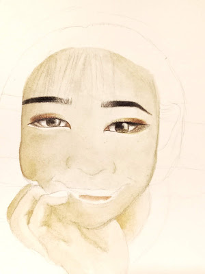 |
Fig 10.2 Sketch and color
|
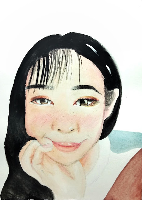 |
| Fig 10.3 Final result of self portrait |
FEEDBACK
At first we had a group critique where all of us placed our artworks on the wall and had a discussion. Most of my classmates said that my self portrait was really cute and it was nice. In addition, Ms Sherry said that she likes the overall result but was confused at first with the blue colour where it was actually part of my clothing.
Project 2 : A Sense of A Place
18.10.18 - 1.11.18 (Week 8 - Week 10)
For the 2nd project, we were tasked to express the feel of a place that we are familiar with or we favour the most. I thought about it a lot of time and decided to make this special Korean bbq place which my friends and I always visited to chill and ate the meat every weekends. Since I visited it every week, I always took picture of the place, the food and the ambience.
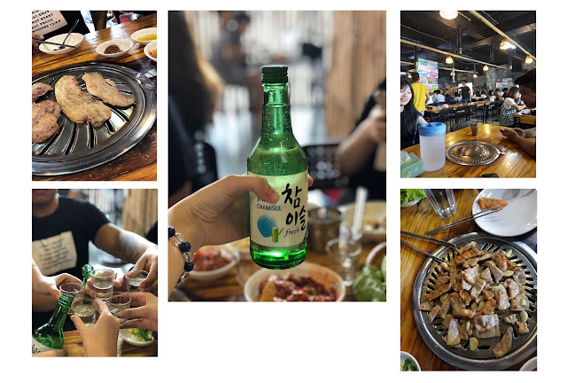 |
| Fig 11.1 References for A Sense of Place |
I started to combine everything which portrayed the reason why I loved to go there with my friends was because of the food itself and the soju. The place really showed excitement and fun experience where you could enjoy your food while talking with your friends.
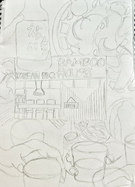 |
| Fig 11.2 Sketch of the project |
Rather than editing the picture in photoshop, I decided to do more illustration as I really like to use watercolour to colour and give more depth to the drawing to make it more realistic.
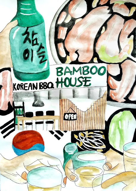 |
| Fig 11.3 Final Result of A Sense of Place |
FEEDBACK
We did a group critique where we could see everyone's amazing works and evaluate. Ms Sherry said that mine was more into illustration and she said that all of us overall did a very good job in our 2nd project.
Project 3 : Billboard Study
30.10.18 - 27.11.18 (Week 10 - Week 14)
For this project, we were told to look around our environment and see the billboards on the street, malls or anywhere. I took some picture of the billboards in my hometown Medan, Indonesia because I went back there during the public holiday. The billboards are mostly colourful and eye-catching. However, I don't really like the style of billboard in Medan because in my opinion the overall composition isn't that good and the typography that is used doesn't match. So I tried to look at other billboards.
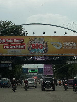 |
| Fig 12.1 Billboard (Car advertisement) |
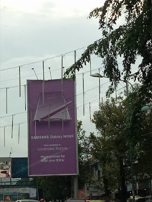 |
| Fig 12.2 Billboard (Phone advertisement) |
I noticed that for the phone advertisement billboard, I could spot centre alignment, size/scale, balance and visual hierarchy. Even though it's minimalistic, I like the design of it.
I took some pictures of the billboards in Kuala Lumpur too and these were the ones I found really interesting and eye-catching, especially the Coca Cola. The Coca Cola billboard is located at the U Residence and everyday I pass by it and it's very funny how the billboard produces sound.
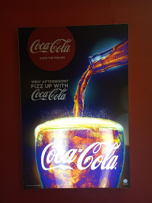 |
| Fig 12.3 Billboard (Drink) |
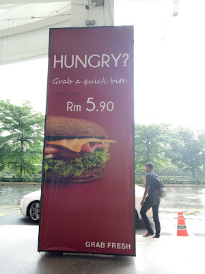 |
| Fig 12.4 Billboard (Food) |
I wanted to make something related to food/drink similar to the Coca-cola ones. I want to make it colourful and cartoon by using computer because I have been using watercolour in my previous projects and exercises and I realised that I never digitise/illustrate my drawing in the computer so I wanted to try something different and used the knowledge I've gained from other subjects and used it in this module.
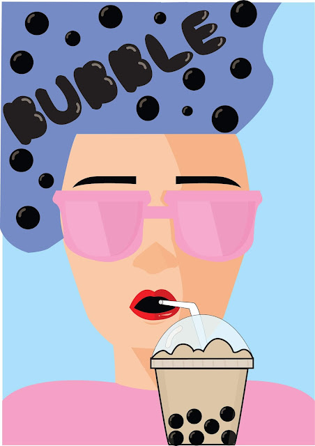
I decided to make about bubble tea because I was passing by the "tea live" shop and every time I pass that shop, the drinks always attract my attention and I noticed that the color of the store is very bright and playful. So overall, I wanted to make a poster about how fun and delicious bubble tea is, the product itself. My goal is to persuade people to drink bubble tea or try it because it's fun and exciting and sweet.
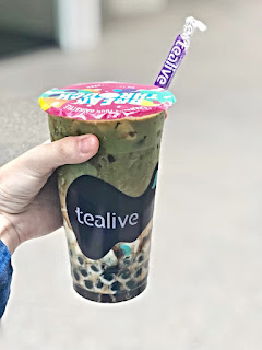 |
| Fig 12.5 Photography for idea |
 |
| Fig 12.6 Photography for idea |
I sketched out my ideas by drawing the girl wearing a glasses in the middle and her size is purposely big and then she's sipping a bubble tea. In addition, a milk on top of her head to show the milk dropping to the bubble tea and also speech bubble behind that says "bubble.
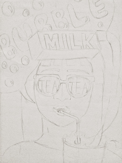 |
| Fig 12.7 1st sketch idea |
 |
| Fig 12.8 2nd sketch idea |
I decided to show Ms Sherry my 1st sketch and she commented that the overall looks good but she personally thought that the milk in the middle is weird and awkward but overall the idea is there and I did a good start. Then, I did some changes where I removed the milk because I agreed with Ms Sherry that the milk on top of her head would look very weird. I tried to experiment a bit by changing the speech bubble to her hair to make it unique. I also played around a bit with the colours like blue, pink, purple to emphasise cute, playful and colourful but keep it simple and minimalistic at the same time.
 |
| Fig 12.9 1st attempt of final project |
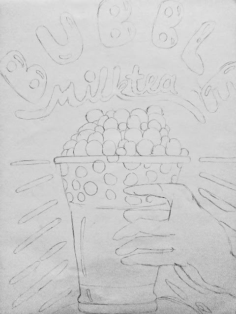
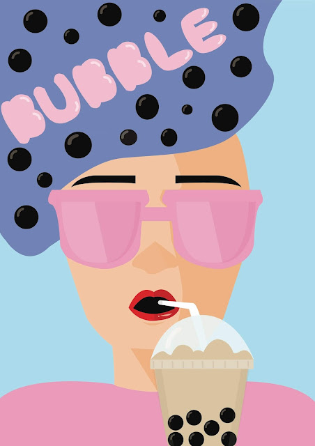
Ms Sherry commented that the hair line was very weird and she was disturbed about it and she suggested me to change the colour of "BUBBLE". My intention was to make the colour match with the colour of the bubble pearl but I also agreed with Ms Sherry that it looks very dull and not exciting. So, I tried using some other bright colours to make it even more fun. In addition, I also removed the outline of the bubble tea because it has different style with the others.
 |
| Fig 12.10 2nd attempt of final project (Final Outcome) |
SKETCHES
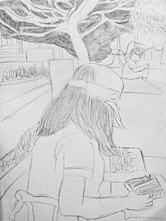 |
| Fig 13.1 Sketch of my classmate - 25.09.18 |
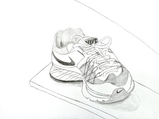 |
| Fig 13.2 Sketch of my shoe - 02.10.18 |
 |
| Fig 13.4 Sketch of my meal - 23.10.18 |
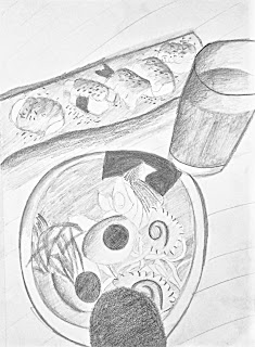 |
| Fig 13.3 Sketch of my lunch - 08.11.18 |


Comments
Post a Comment