TYPOGRAPHY - PROJECT 1
TYPOGRAPHY - PROJECT 1

Maydeline (0335392)
Typography
Project 1 - Text Formatting & Expression
LECTURES
Lecture 7 : Text / Tracking (Kerning and Letterspacing)
10.10.18 (Week 7)
Kerning
Kerning is the automatic adjustment of space between letters.
Kerning is the automatic adjustment of space between letters.
Letterspacing
Letterspacing means to add space between the letters.
Letterspacing means to add space between the letters.
Tracking
The addition and removal of a space in a word or sentence.
The addition and removal of a space in a word or sentence.
 |
| Fig 1.1 Tracking and Kerning |
 |
| Fig 1.2 Letterspacing |
Normal Tracking
| Fig 1.3 Normal Tracking |
Loose Tracking
| Fig 1.4 Loose Tracking |
Tight Tracking
We also learned 4 ways to format text, they are:
Flush left : Mirrors are the asymmetrical experience of handwriting. Each line starts at the same point but ends whenever the last word on the line ends. The spaces between words are consistent throughout the text to create an even grey value.
Centered : Symmetry upon text, equal value and weight to both ends of any line. It adds a pictorial quality to material that is non-pictorial by nature. It's important to amend line breaks so that the text won't look too ragged.
Flush Right : The format places emphasis on the end of a line. It can be useful when the text and image might be ambiguous without a strong orientation to the right.
Justified : The format imposes a symmetrical shape on the text. It is achieved by expanding or reduced spaces between words and letters. It can produce rivers of white space running vertically throughout the text. However, there is a chance that lines will break and hyphenation is required to amend the problem.
There are some elements that would help the text to be more readable:
Type setting : The text should be arm-length and readable(8-12pt size)
Line length : The good length of distance of the sentence should be 35-65. (10/12-10/13-10/14)
Leading : Text shouldn't be too tight/too loose so that the readers won't lose their focus.
Lecture 8 : -
17.10.18 (Week 8)
We had no lecture this week that we continued doing our project 1.
INSTRUCTIONS
| Fig 1.5 Tight Tracking |
We also learned 4 ways to format text, they are:
Flush left : Mirrors are the asymmetrical experience of handwriting. Each line starts at the same point but ends whenever the last word on the line ends. The spaces between words are consistent throughout the text to create an even grey value.
Centered : Symmetry upon text, equal value and weight to both ends of any line. It adds a pictorial quality to material that is non-pictorial by nature. It's important to amend line breaks so that the text won't look too ragged.
Flush Right : The format places emphasis on the end of a line. It can be useful when the text and image might be ambiguous without a strong orientation to the right.
Justified : The format imposes a symmetrical shape on the text. It is achieved by expanding or reduced spaces between words and letters. It can produce rivers of white space running vertically throughout the text. However, there is a chance that lines will break and hyphenation is required to amend the problem.
There are some elements that would help the text to be more readable:
Type setting : The text should be arm-length and readable(8-12pt size)
Line length : The good length of distance of the sentence should be 35-65. (10/12-10/13-10/14)
Leading : Text shouldn't be too tight/too loose so that the readers won't lose their focus.
Lecture 8 : -
17.10.18 (Week 8)
We had no lecture this week that we continued doing our project 1.
INSTRUCTIONS
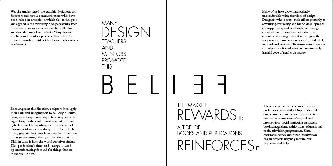
Project 1 : Text Formatting & Expression
For this project, we used a software called Adobe Indesign to design a book where we got the text from this website called eye magazine.com. At first, Mr Vinod did a lecture of how to use the indesign tools and also how to create the documents. We were also told to pick a typeface that is suitable for the book. He also reminded us about using design principles such as hierarchy, contrast, balance, alignment and etc. This project is about creating a book where we chose sentences that we wanted to express and format using an article.
http://www.eyemagazine.com/feature/article/first-things-first-manifesto-2000
Text Formating - Kerning&Letterspace (Week 7)
For an exercise, Mr Vinod told us to format the article using the left align, centre align, right align and justified. We also had to choose our typeface out of the 10 typefaces that were given and also the point size of the text. Hence, we learned how to adjust the paragraph spacing, kerning, letter spacing a word or sentence.
 |
| Fig 2.1 Left Alignment |
 |
| Fig 2.2 Center Alignment |
 |
| Fig 2.3 Right Alignment |
 |
| Fig 2.4 Justified Alignment |
This week, we were told to choose one of the text alignment where I chose left alignment. We had to think about the layout of our text and also how to express the sentences. Mr Vinod told us to look at some references in Pinterest or other websites like Behance, Dribble and etc.
 |
| Fig 2.5 1st attempt Front Cover |
 |
| Fig 2.6 1st Attempt 3/8 |
 |
| Fig 2.7 1st attempt 5/8 |
 |
| Fig 2.8 2nd attempt Front Cover |
 |
| Fig 2.9 2nd attempt Page 3/8 |
 |
| Fig 2.10 2nd attempt Page 5/8 |
 |
| Fig 2.11 3rd attempt Page 3/8 |
 |
| Fig 2.11 3rd attempt Page 3/8 |
 |
| Fig 2.12 3rd attempt Page 5/8 |
 |
| Fig 2.13 Page 7/8 |
 |
| Fig 2.14 Back Cover |
Mr Vinod said that the use of black in internal pages was used to hide the lack of balance, interaction, alignment between the body of text and text expression and when they are viewed together, both seem separate and not of the same book. The only exception being the cover and back cover. I decided to change the background to white and also did some rearrangement.
 |
| Fig 2.15 4th attempt Page 2 and 3 |
 |
| Fig 2.16 4th attempt Page 4 and 5 |
 |
| Fig 2.17 4th attempt Page 6 and 7 |
Fig 2.17 Thumbnail for Project 1
 |
| Fig 2.18 Final Outcome : Front Cover (Page 1) |
 |
| Fig 2.19 Final Outcome : Page 2-3 |
 |
| Fig 2.20 Final Outcome : Page 4-5 |
 |
| Fig 2.21 Final Outcome : Page 6-7 |
 |
| Fig 2.22 Final Outcome : Back Cover (Page 8) |
Fig 2.23 Final Outcome PDF Version
 |
| Fig 2.24 Thumbnail (Project 1) |
 |
| Fig 2.25 Print Book (Front Cover Page 1) |
 |
| Fig 2.26 Print Book (Page 2 & Page 3) |
 |
| Fig 2.27 Print Book (Page 4 & 5) |
 |
| Fig 2.28 Print Book (Page 6 & 7) |
 |
| Fig 2.30 Print Book (Back Cover Page 8) |
FEEDBACK
Week 7
Mr Vinod and Mr Shamsul saw my 6 type expression and they approved all of them, but for the "sparkle", they stated that I should make the outline of the letter thinner. Additionally, the animation for rage isn't really good as it doesn't show rage but shaky instead. We were also informed to write our names, student IDs and date at the back of every work that we have printed using pencil.
Week 8
Mr Vinod briefed us about how our e-portfolio should look like because the majority of the students weren't following the instructions. He also told us to read more books and put it in the further reading, Additionally he also reminded us to put the feedbacks in the feedback form every week. In addition, Mr Vinod said that for my book (project 1), it wasn't recommended to have 3 different fonts because they won't match each other and he also asked me to highlight the "First" word using another way instead of putting white boxes. He also asked me to see more references and searched for designers to view their typography posters. For my 2nd attempt, Mr Shamsul said that it was very hard for him to read some words and he asked me to organise the sentences more until they are readable.
REFLECTION
EXPERIENCES
Week 7
I've learned how to use another new software called InDesign which was really difficult for me to use at first but as I've explored the tools, I could do lots of things in the adobe.
Week 8
Making a book was a bit challenging for me especially when I had to express the sentence but some didn't really work. It was definitely a challenging experience. I had to make sure that the design of the book had to be balanced.
OBSERVATIONS
Week 7
I discovered that a lot of people weren't familiar with this adobe too. Moreover, we have to exaggerate a bit when expressing the sentences so that it will be expressive.
Week 8
I observe that colours and typefaces play huge roles in design to make sure that the readers could easily read the text. In addition, I observed lots of books have minimalistic design and they are very balanced that the overall looks really good.
FINDINGS
Week 7
I found it hard to use InDesign as how it was different from Photoshop and Illustrator. I also had a hard time doing kerning and tracking because I had to really see deeply but I got used to it.
Week 8
I found out that I shouldn't use grey colour fonts if I really want to show the readers the text because it would be hard for them to read so I had to be careful in choosing.
FURTHER READING
How To Use Type
Week 7
 |
| Fig 3.1 How to use Type |
Chapter 2 page 58 : Paragraphs
In this chapter, leading, kerning, and tracking can affect how type performs on a page. There are other factors relating to paragraphs or sections of body text that may have an impact on legibility and/or readability. Such factors can determine how the type looks and therefore how it is interpreted. One of the most important is paragraph alignment: whether text is aligned or ranged left or right, justified or entered. The most commonly used alignments in Western design are left aligned because the way of the right-hand line endings do not align with the column edge and justified. Right alignment and entering are less frequently used in body text, for reasons of readability. The eye finds it difficult to cope with the fact that in each of these two alignments the starting points of lines of text are not aligned vertically.
There are many examples where different alignments are combined to create emphasis and visual effect. One is in move titles where right and left aligned text are butted up against each other to differentiate between 2 sections of information and give a mirrored effect. There are some who hold the view that justified text can never be justified because of the spacing between words can be quite wide in justified, it takes a lot of skill and experience to ensure that a block of text does not contain rivers. Rivers are formed when a series of large gaps between words link together into a trickle-like pattern down the page. They can be visually distracting and therefore affect readability, particularly for those with dyslexia or visual impairments and, in our view, look ugly anyway unless designed for a specific effect. Rivers can be seen more clearly if you squint at text, hold it upside down or view it in a mirror.
 |
| Fig 3.2 Example of a webpage design using text alignment |
Design Elements : A Graphic Style Manual
Week 8
 |
| Fig 3.3 Design Elements A Graphic Style Manual |
Chapter 5 page 233 : Merging Type and Image
http://web.b.ebscohost.com/ehost/ebookviewer/ebook?sid=efca789a-ce4b-48b5-ac49-d0d5522b512d%40pdc-v-sessmgr03&ppid=pp_Cover1&vid=0&format=EB
Every design project incorporates just two different parts-type and image- and so the most important question to address, therefore is how to put these 2 things together. The results of poorly integrated type and image fall into 2 categories: The first includes type that has nothing in common with images around it; the second includes typography that has been so aggressively integrated with image that it becomes illegible/unnavigable.
Laying type into/across an image is a quick way of finding visual relationships. Their immediate juxtaposition will reveal similarities among elements in each, as well as opposition among others. The rag of a short paragraph might have a similar shape as a foreground element in a photograph, for instance, even while the paragraph's optimal width, being horizontal in proportion, opposes the same foreground element's vertically. To break down these two states of possible type/image relationship-formal congruence, or similarity, and formal opposition, or contrast-into categories that concern only 4 different attributes : shape, texture, value and rhythm. These attributes would make it easier to integrate typography and image.
 |
| Fig 3.4 Example of poster including Typography and Image |


Comments
Post a Comment