INTERACTIVE DESIGN - EXERCISES
INTERACTIVE DESIGN - EXERCISES
 04.04.19 - 23.05.19 (Week 1 - Week 4)
Maydeline (0335392)
Interactive Media
Exercises
LECTURES
Lecture 1 : Module Briefing / Web evaluation
04.04.19
On the first week, we were briefed on the upcoming exercises and projects for this module. We were introduced to one of the software called Adobe Dreamweaver where we would use it in the upcoming projects to make websites. Mr Shamsul informed us about 2 common terms used in websites.
HTML = HyperText Marking Language
Common coding at the start of a web page
CSS = Cascading Style Sheets
Used for color coding, font type/size
Lecture 2 : UI & UX Design
11.04.19
We had a lecture of User Interface and User experience design.
User Experience (UX) : design the structure and layout of a website and to anticipate the feel of user interactions.
User Interface (UI) : functionality where the elements have to be easily accessed, understandable and generally easily displayed on a website.
We should remember that functionality comes first then aesthetic.
Here is a video that shows why UI and UX are very important in our daily lives :
Lecture 3 : HTML Codes
25.04.19
We had a lecture on the basic HTML Codes that are used in website when we are going to write the content.
<html> </html>
<body> </body>
<header> </header>
Heading : h1 to h6 (As the number gets smaller, the font-size gets smaller as well.)
Paragraph : <p> </p>
List : <li> </li>
Unordered list : <ul> </ul>
Ordered list : <ol> </ol>
Hyperlink : <a href> </a>
Image : <img src=" ">
Lecture 4 : CSS Extra Markup
02.05.19
We had a another lecture of HTML and CSS with methods on how to include CSS in the HTML. The lecturers also introduced us about block-level element, in-line element, and also ID/Class attribute.
Block-level element: Has a new line break in between.
<h1> <h6> <ol> <ul> <li>
In-line element: Appears in a block-level element.
<p> <img> <a> <b> <i>
Attribute : It gives extra information on the element. It is the language of HTML such as <href> <title>.
ID/Class Attribute
<id=" "> <class=" ">
CSS : creates an appearance of the html
<style> </style>
Two parts: selection and declaration within = {}
ex: { font-family: arial; }
Lecture 6 : Working with Cascading Style Sheets in HTML
09.05.19
This week, we had an extra lecture about CSS attributes.
1. Linking downloaded fonts online in CSS
<link href="https://fonts.googleapis.com/css?family=Just+Another+Hand"rel="stylesheet">
2. Heading <h1> to <h6>
h1 {
font-family: Arial;
color: #000000;
}
3. Ordered/unordered list
o1 {
font-family: Arial;
color: #000000;
}
4. Nested list
li {
list-style: none;
}
5. Highlighting a text
#aboutpara {
}
6. HTML Scrolling
html {
scroll-behaviour: smooth;
}
7. Background image
body {background-image: url("background.jpg");
background-repeat: no-repeat;
}
8. Top navigation bar link format
a:link
a:visited
a:hover
a:active
9. Syntax to allow CSS in HTML
<style type="text/css">
INSTRUCTIONS
EXERCISES
Exercise 1 : Web Evaluation
04.04.19 (Week 1)
For our first class, we were tasked to pick 6 good websites and 6 bad websites and explain the reasons, mention the target audience, purpose and what the website is about. These are the 2 websites given :
https://www.webbyawards.com/
https://www.thebestdesigns.com/
We were divided into groups and here are the list of the good and bad websites we have chosen :
6 Good Websites
6 Bad Websites
Exercise 2 : User Interface (Information Kiosk)
11.04.19 (Week 2)
We are tasked to design a information kiosk about Taylor's University. We had to think about the target audience and scenario to navigate their way to a certain place in Taylor's University. Our group decided to go with a new student who is finding Lecture Theatre 1 which located in Block B. We had to design a good user interface in order for to people could easily understand or know easily how to use.
After designing the user interface by drawing on the papers, we did a user testing on our classmates and they would give us feedback.
Exercise 3 : HTML Exercise
25.04.19
This week, we learned how to try out HTML text on Text Edit for Mac and Notepad for Windows to get the feel of coding a website. We learned the basic elements such as title, headings, paragraphs, break lines, list items.
After receiving feedback from the lecturer, Mr Shamsul told me to add "Back To Top" button in my website. In addition, I also added background-colour to make it nicer.
Here is the final result : https://maydelinejong.000webhostapp.com/exercise_html/index.html#about
Adding CSS
09.05.19
We continued the exercise that we did on TextEdit/Notepad, but now we were introduced to Dreamweaver which is where we are going to style our website using CSS. We learned some style attributes by coding and we tried it out on our previous HTML file.
Link : https://maydelinejong.000webhostapp.com/exercise_html/Exercise.html
Exercise 4 : HTML & CSS Document Development
16.05.19
This week's exercise is to make a layout which contains header, section, aside, footer in Dreamweaver using HTML and CSS. Firstly, we created the style sheet on its own. We were introduced to margin, padding, and container.
After we have designed our layout, we did an exercise to design a layout and we had to put the given content inside the layout. Here is the given information:
We started off with the basic html file first and then do the css last. The lecturers also taught us how to link the html and css in one file so that it is much more convenient.
Mr Shamsul told me to make the "Document Set-Up" and "More Photoshop Tips & Tricks" left-align instead of right-align. I took the feedback and changed that part.
After showing him one more time, he told me that I should change the alignment for everything, but overall it is good.
Link : https://maydelinejong.000webhostapp.com/LAYOUTEXERCISE/exercise2_html/index.html
After getting feedback from Mr Shamsul, he told me that my layout is good but the spacing needs to be fixed and also the background color is too simple, I could make it more exciting.
Link: https://maydelinejong.000webhostapp.com/LAYOUTEXERCISE/EXERCISE/index.html
FEEDBACK
Week 2
General Feedback: When designing a user interface or user experience design, we have to remember to think from a user's perspective when using the application/website/product. Our interface design shouldn't have graphic elements because designers rarely use that. We have to make sure that our interface is convenient and easy to use because our classmate had a hard time using it.
Specific Feedback: Mr Shamsul reminded us not to put visual illustration in the user interface of the information kiosk because it would confuse the user.
Week 4
General Feedback: Mr Shamsul reminded us to write the codes in the correct form or else errors would occur.
Week 5
Specific Feedback: Mr Shamsul commented that my web page is okay but he advised me to put "Back To Top" button so that it is easier and faster if the user wants to scroll up.
Week 6
General Feedback: Mr Shamsul told us to upload our HTML file to a free website host. In addition, he told us to explore the codes that we have used today.
Specific Feedback: No feedback as we continued doing the layout exercise.
Week 7
General Feedback: Mr Shamsul reminded us to check the opening and closing tag properly for each element so that there wouldn't errors when displaying in the browser.
Week 8
Specific Feedback: Mr Shamsul commented that my website looks good but there are some parts I need to fix such as the "DOCUMENT SET-UP" and "MORE PHOTOSHOP TIPS&TRICKS" should be left-aligned instead of right-aligned. Then, he told me the border on the container its better to remove it. After showing him one more time, he told me that I should change the alignment for everything, but overall it is good.
REFLECTIONS
Experiences
Week 1
When evaluating the good and bad websites, I realised how it's very important for colours, text size, readability and other important factors that could determine the website is good or not.
Week 2
I had a hard time designing a good user interface with my teammates because I was trying to not create lots of pages, but after seeing everyone's design interface, I have understood how crucial is it to have good interface.
Week 5
I got to learn more about HTML and some tags that make my website more aligned and neat. It was exciting to see how the codes translate into a web page, the result made me satisfied.
Week 6
When I got to use Dreamweaver, I was a bit nervous as I was afraid it was too hard. However, after understanding the tags and some css codes, it was not that bad and it makes my website looks more appealing than I did in Text Edit.
Week 7
This week I got to learn how to link my HTML file and CSS file, it makes coding in dreamweaver more convenient as I don't need to open 2 files at once but I could link them.
Observations
Week 1
I observed how designers tend to have lots of different layouts to make their websites stand out but they still don't neglect the web design principles such as hierarchy, readability and etc.
Week 2
I observed how each group have different ways to design interface and they prioritise visual and also good interface. Overall, I think all of the groups did a very good job because it's easy to use their user interface.
Week 5
I observed how most of us kept forgetting some coding elements such as the opening and closing tags < > </>. If we forget to put it, the elements won't show in the web page. This is very crucial and we should always remember the basic tags.
Week 6
I observed how Dreamweaver provides the closing element which makes us more convenient and not forget the closing tag but we should always double check.
Week 7
In this class, I got to learn how to style a html file using css way by creating a different file while linking them together. It was pretty interesting to style the layout using codes and there are many different ways to try.
Findings
Week 1
I found out that minimalism and aesthetic don't define a good website but web design principles are what make a website good. In addition, some designers also don't put enough information and also I found some bad websites where it was hard to identify what the website is about.
Week 2
I found out that prototyping and user testing are very important when it comes to designing websites, applications and products.
Week 5
While trying out the HTML codes, I found how crucial it is to remember to input the opening and closing tags so that the elements would be apply in the website and no errors would be found.
Week 6
From this exercise, I found and learned that HTML and CSS are both needed in making websites. HTML is used for the content of the website and CSS is for styling the website to make it looks visually appealing and attractive.
Week 7
When I was doing the exercise, I found that different codes could make a difference in styling website as it could change certain elements of the page. It isn't as complicated as you think to use CSS as the attributes and properties are automatically given when we type it out.
FURTHER READINGS
How to Design Websites
Week 1 - Week 2
Chapter : Images and Colour Schemes
Light colour is inherently additive; pigment colour is inherently subtractive. A colour display on a monitor starts out black, and light is added to the screen to create colour. The more of the primary colours red, green and blue are added, the brighter and the lighter the screen becomes. At 100% intensity of red, green and blue, the screen is white. Regardless of the physics of how colour is created, whether it is transmitted or reflected light, most designers and illustrators will use colour on screen as if it were paint, i.e. pigment. It thus makes more sense to talk about red and green being complementary colours than red and cyan. The relationship between colours that you see on screen are exactly same as what you see in print. The primary colours of pigments are red, yellow and blue. The secondary colours are made from a mixture of two primaries : red and yellow make orange' red and blue make purple; yellow and blue make green. The tertiary colours are made from a mixture of 2 secondaries, or 2 complementary colours, such as red and green. Examples are olive green, maroon, and various browns.
A neutral colour scheme includes colours not found on the colour wheel such as beige, brown, white, black and grey. An accented neutral colour scheme is mainly neutral colours plus highlights of a brighter colour such as red.
Choosing a colour scheme is a highly subjective process. Your clients may have colours they prefer, in their logos or corporate identify branding for example, so you may be constrained and guided by these. You may want to use colours sampled from an image on your home page. You should be clear about your site's brand message and choose colours that reinforce it. For a financial institution, for example, use cool, muted colours such as blues, greys and greens, which convey stability and trust. On the other hand, a site aimed at a younger audience could make us of brighter, brushes, more saturated colours. Don't overdo the number of colours in your palette: three or four colours, plus white and black, should be enough. Too many colours can distract and confuse the user.
Exploring The Latest Web Design Trends Together With Be Theme
Week 5 - Week 6
https://www.smashingmagazine.com/2019/03/web-design-trends-betheme/
1. Digital Illustrations
Digital illustrations have become one of the most important trends in visual design. Relevant illustrations make your design stand out from a crowd and establish a truly emotional connection with visitors.
Two types of illustrations are popular among digital designers: hand-draw flat illustrations and three-dimensional ones.
2. Vibrant Colors
Vibrant colors give visual interest to a layout. User attention is a precious resource, and one of the most effective ways to grab attention is by using colors that stand out. Bright colours used for the background can capture the visitor's attention and contribute to a truly memorable experience.
3. Hero Video Headers
High-speed connections make it much easier for web designers to turn their home pages into immersive movie-style experiences. Video engages users, and users are more willing to spend time watching clips. Video clips used in a hero section can vary from a few seconds of looped video to full-length preview clips with audio.
4. Split Screen
Split screen is relatively simple design technique that divide screen into 2 parts and use each part to deliver a distinct message. This technique translates well on mobile; 2 horizontal panels of content can be collapsed into vertical content blocks on small screens. This is effective if you want to deliver 2 main messages. It also works well when you have to pair a text message with relevant imagery.
5. Geometric Patterns
Designers can use geometric shapes and patterns endlessly to create beautiful ornaments. Designers can use SVG images and high-resolution PNGs with geometric patterns as backgrounds. You won't have to worry about how they will look on small and large displays when the background is scaled.
6. Gradients and Duotones
Designers often use gradients to give their work a little more depth. Modern graphic design trends dictate use of big, bold and colourful gradients, which help designers make a statement. They can experiment with various colors and types, using radial gradient, linear gradients, etc.
7. Bold Typography
Bold typography make it easy to read the text. A design should honour the message that the product's creators want to deliver to their users.
Wireframing, Prototyping, Mockuping - What's the Difference?
Week 7
https://designmodo.com/wireframing-prototyping-mockuping/
Wireframe
A wireframe is a low fidelity representation of a design.
Wireframes should contain a representation of every important piece of final product.
It should clearly show:
Prototype
A prototype is a middle to high fidelity representation of the final product, which simulates user interface interaction. It allows user to:
Mockup
A mockup is a middle to high fidelity, static, design representation. Very often a mockup is a visual design draft, or even the actual visual design. A well created mockup represents the structure of information, visualises the content and demonstrates the basic functionalities in a static way and encourages people to actually review the visual side of the project.
Maydeline (0335392)
Interactive Media
Exercises
LECTURES
Lecture 1 : Module Briefing / Web evaluation
04.04.19
On the first week, we were briefed on the upcoming exercises and projects for this module. We were introduced to one of the software called Adobe Dreamweaver where we would use it in the upcoming projects to make websites. Mr Shamsul informed us about 2 common terms used in websites.
HTML = HyperText Marking Language
Common coding at the start of a web page
CSS = Cascading Style Sheets
Used for color coding, font type/size
Lecture 2 : UI & UX Design
11.04.19
We had a lecture of User Interface and User experience design.
User Experience (UX) : design the structure and layout of a website and to anticipate the feel of user interactions.
User Interface (UI) : functionality where the elements have to be easily accessed, understandable and generally easily displayed on a website.
We should remember that functionality comes first then aesthetic.
Here is a video that shows why UI and UX are very important in our daily lives :
Lecture 3 : HTML Codes
25.04.19
We had a lecture on the basic HTML Codes that are used in website when we are going to write the content.
<html> </html>
<body> </body>
<header> </header>
Heading : h1 to h6 (As the number gets smaller, the font-size gets smaller as well.)
Paragraph : <p> </p>
List : <li> </li>
Unordered list : <ul> </ul>
Ordered list : <ol> </ol>
Hyperlink : <a href> </a>
Image : <img src=" ">
Lecture 4 : CSS Extra Markup
02.05.19
We had a another lecture of HTML and CSS with methods on how to include CSS in the HTML. The lecturers also introduced us about block-level element, in-line element, and also ID/Class attribute.
Block-level element: Has a new line break in between.
<h1> <h6> <ol> <ul> <li>
In-line element: Appears in a block-level element.
<p> <img> <a> <b> <i>
Attribute : It gives extra information on the element. It is the language of HTML such as <href> <title>.
ID/Class Attribute
<id=" "> <class=" ">
CSS : creates an appearance of the html
<style> </style>
Two parts: selection and declaration within = {}
ex: { font-family: arial; }
Lecture 6 : Working with Cascading Style Sheets in HTML
09.05.19
This week, we had an extra lecture about CSS attributes.
1. Linking downloaded fonts online in CSS
<link href="https://fonts.googleapis.com/css?family=Just+Another+Hand"rel="stylesheet">
2. Heading <h1> to <h6>
h1 {
font-family: Arial;
color: #000000;
}
3. Ordered/unordered list
o1 {
font-family: Arial;
color: #000000;
}
4. Nested list
li {
list-style: none;
}
5. Highlighting a text
#aboutpara {
}
6. HTML Scrolling
html {
scroll-behaviour: smooth;
}
7. Background image
body {background-image: url("background.jpg");
background-repeat: no-repeat;
}
8. Top navigation bar link format
a:link
a:visited
a:hover
a:active
9. Syntax to allow CSS in HTML
<style type="text/css">
INSTRUCTIONS
EXERCISES
Exercise 1 : Web Evaluation
04.04.19 (Week 1)
For our first class, we were tasked to pick 6 good websites and 6 bad websites and explain the reasons, mention the target audience, purpose and what the website is about. These are the 2 websites given :
https://www.webbyawards.com/
https://www.thebestdesigns.com/
We were divided into groups and here are the list of the good and bad websites we have chosen :
6 Good Websites
 |
| Fig 1.1 https://hobes.co/ |
 |
| Fig 1.2 https://www.allthatgrows.in |
 |
| Fig 1.3 http://twentytwentytwo.co.uk/ |
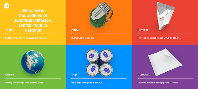 |
| Fig 1.4 http://jonathanpatterson.com/ |
 |
| Fig 1.5 https://drroebucks.com |
 |
| Fig 1.6 https://smashmallow.com/ |
 |
| Fig 1.7 http://themarcus.com/ |
 |
| Fig 1.8 http://www.kccreepfest.com/ |
 |
| Fig 1.9 https://weareoutline.com/ |
 |
| Fig 1.10 https://www.weareoust.co/ |
 |
| Fig 1.11 https://madebyfew.com/ |
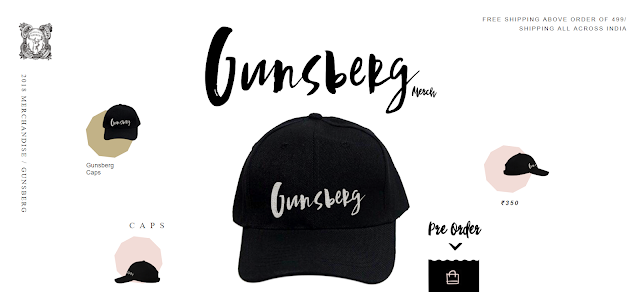 |
| Fig 1.2 https://merch.gunsberg.in/ |
Exercise 2 : User Interface (Information Kiosk)
11.04.19 (Week 2)
We are tasked to design a information kiosk about Taylor's University. We had to think about the target audience and scenario to navigate their way to a certain place in Taylor's University. Our group decided to go with a new student who is finding Lecture Theatre 1 which located in Block B. We had to design a good user interface in order for to people could easily understand or know easily how to use.
After designing the user interface by drawing on the papers, we did a user testing on our classmates and they would give us feedback.
 |
| Fig 2.1 Progress of drawing user interface |
 |
| Fig 2.2 Final Outcome : Homepage |
 |
| Fig 2.3 Final Outcome : Academics Page |
 |
| Fig 2.4 Final Outcome : Classroom Page |
 |
| Fig 2.5 Final Outcome: Building Image (Block B) + Building Image (Block B) + Information on the lecture theater on level 2 (Hover Effect) |
Exercise 3 : HTML Exercise
25.04.19
This week, we learned how to try out HTML text on Text Edit for Mac and Notepad for Windows to get the feel of coding a website. We learned the basic elements such as title, headings, paragraphs, break lines, list items.
 |
| Fig 3.1 Coding in Text Edit |
 |
| Fig 3.2 Coding in Text Edit |
 |
| Fig 3.3 Result of Coding |
Here is the final result : https://maydelinejong.000webhostapp.com/exercise_html/index.html#about
Adding CSS
09.05.19
We continued the exercise that we did on TextEdit/Notepad, but now we were introduced to Dreamweaver which is where we are going to style our website using CSS. We learned some style attributes by coding and we tried it out on our previous HTML file.
 |
| Fig 3.4 Adding CSS |
 |
| Fig 1.6 Result |
 |
| Fig 3.5 Result (1) |
 |
| Fig 3.6 Result (2) |
 |
| Fig 3.7 Result (3) |
Exercise 4 : HTML & CSS Document Development
16.05.19
This week's exercise is to make a layout which contains header, section, aside, footer in Dreamweaver using HTML and CSS. Firstly, we created the style sheet on its own. We were introduced to margin, padding, and container.
 |
| Fig 4.1 HTML Codes |
 |
| Fig 4.2 CSS Codes |
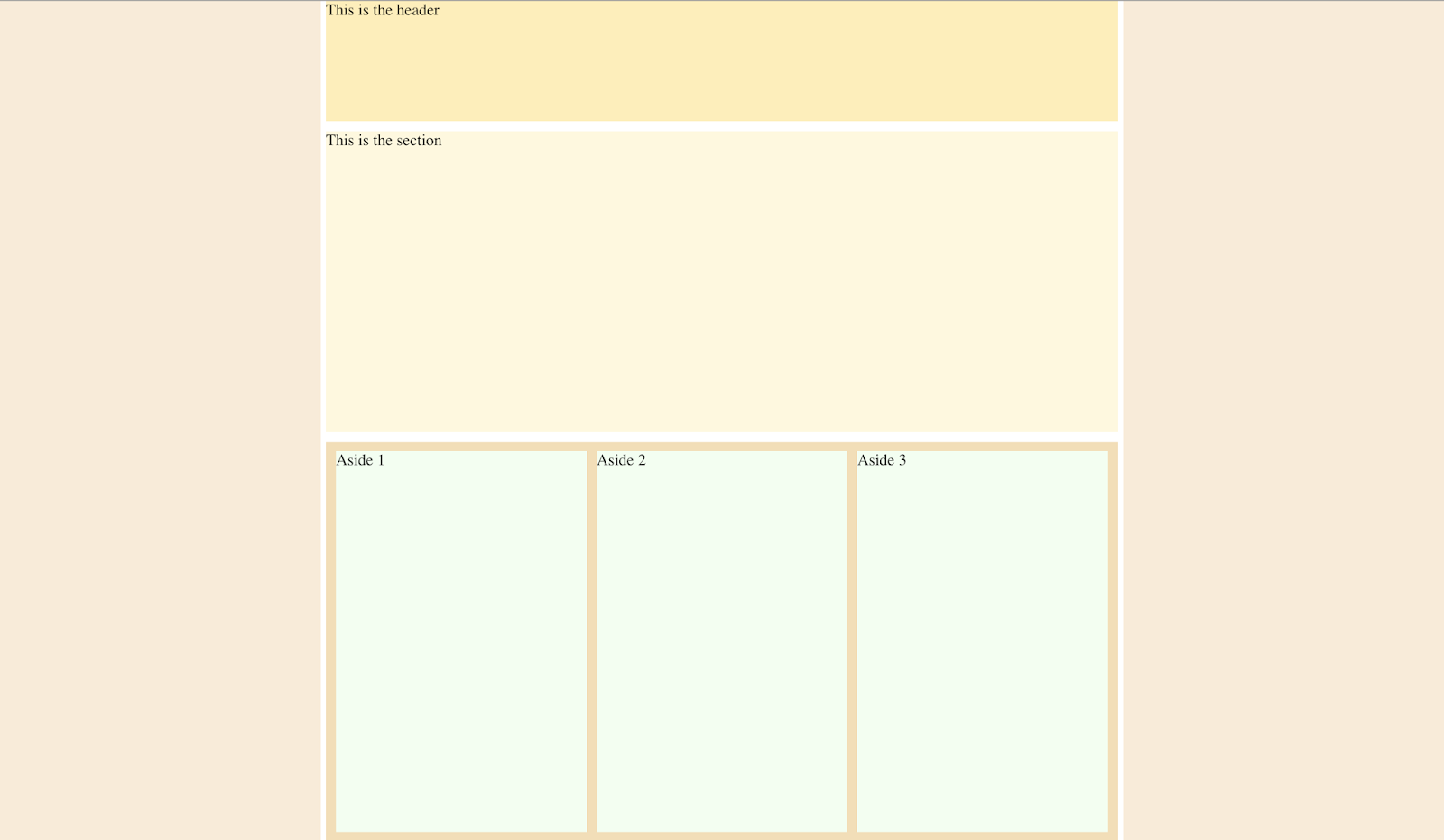 |
| Fig 4.3 Result of layout (Header, Section, Aside) |
 |
| Fig 4.4 Result of layout (Section, Aside, Footer) |
Fig 4.5 PDF Content provided in Google Classroom
 |
| Fig 4.6 HTML Codes |
 |
| Fig 4.7 CSS Codes |
 |
| Fig 4.8 Outcome of layout (1) Attempt 1 |
 |
| Fig 4.9 Outcome of layout (2) Attempt 1 |
 |
| Fig 4.10 Outcome of layout (3) Attempt 1 |
 |
| Fig 4.11 Attempt 2 |
 |
| Fig 4.12 Attempt 2 |
 |
| Fig 4.13 Attempt 2 |
After getting feedback from Mr Shamsul, he told me that my layout is good but the spacing needs to be fixed and also the background color is too simple, I could make it more exciting.
 |
| Fig 4.14 Final Result |
 |
| Fig 4.15 Final Result |
 |
| Fig 4.16 Final Result |
FEEDBACK
Week 2
General Feedback: When designing a user interface or user experience design, we have to remember to think from a user's perspective when using the application/website/product. Our interface design shouldn't have graphic elements because designers rarely use that. We have to make sure that our interface is convenient and easy to use because our classmate had a hard time using it.
Specific Feedback: Mr Shamsul reminded us not to put visual illustration in the user interface of the information kiosk because it would confuse the user.
Week 4
General Feedback: Mr Shamsul reminded us to write the codes in the correct form or else errors would occur.
Week 5
Specific Feedback: Mr Shamsul commented that my web page is okay but he advised me to put "Back To Top" button so that it is easier and faster if the user wants to scroll up.
Week 6
General Feedback: Mr Shamsul told us to upload our HTML file to a free website host. In addition, he told us to explore the codes that we have used today.
Specific Feedback: No feedback as we continued doing the layout exercise.
Week 7
General Feedback: Mr Shamsul reminded us to check the opening and closing tag properly for each element so that there wouldn't errors when displaying in the browser.
Week 8
Specific Feedback: Mr Shamsul commented that my website looks good but there are some parts I need to fix such as the "DOCUMENT SET-UP" and "MORE PHOTOSHOP TIPS&TRICKS" should be left-aligned instead of right-aligned. Then, he told me the border on the container its better to remove it. After showing him one more time, he told me that I should change the alignment for everything, but overall it is good.
REFLECTIONS
Experiences
Week 1
When evaluating the good and bad websites, I realised how it's very important for colours, text size, readability and other important factors that could determine the website is good or not.
Week 2
I had a hard time designing a good user interface with my teammates because I was trying to not create lots of pages, but after seeing everyone's design interface, I have understood how crucial is it to have good interface.
Week 5
I got to learn more about HTML and some tags that make my website more aligned and neat. It was exciting to see how the codes translate into a web page, the result made me satisfied.
Week 6
When I got to use Dreamweaver, I was a bit nervous as I was afraid it was too hard. However, after understanding the tags and some css codes, it was not that bad and it makes my website looks more appealing than I did in Text Edit.
Week 7
This week I got to learn how to link my HTML file and CSS file, it makes coding in dreamweaver more convenient as I don't need to open 2 files at once but I could link them.
Observations
Week 1
I observed how designers tend to have lots of different layouts to make their websites stand out but they still don't neglect the web design principles such as hierarchy, readability and etc.
Week 2
I observed how each group have different ways to design interface and they prioritise visual and also good interface. Overall, I think all of the groups did a very good job because it's easy to use their user interface.
Week 5
I observed how most of us kept forgetting some coding elements such as the opening and closing tags < > </>. If we forget to put it, the elements won't show in the web page. This is very crucial and we should always remember the basic tags.
Week 6
I observed how Dreamweaver provides the closing element which makes us more convenient and not forget the closing tag but we should always double check.
Week 7
In this class, I got to learn how to style a html file using css way by creating a different file while linking them together. It was pretty interesting to style the layout using codes and there are many different ways to try.
Findings
Week 1
I found out that minimalism and aesthetic don't define a good website but web design principles are what make a website good. In addition, some designers also don't put enough information and also I found some bad websites where it was hard to identify what the website is about.
Week 2
I found out that prototyping and user testing are very important when it comes to designing websites, applications and products.
Week 5
While trying out the HTML codes, I found how crucial it is to remember to input the opening and closing tags so that the elements would be apply in the website and no errors would be found.
Week 6
From this exercise, I found and learned that HTML and CSS are both needed in making websites. HTML is used for the content of the website and CSS is for styling the website to make it looks visually appealing and attractive.
Week 7
When I was doing the exercise, I found that different codes could make a difference in styling website as it could change certain elements of the page. It isn't as complicated as you think to use CSS as the attributes and properties are automatically given when we type it out.
FURTHER READINGS
How to Design Websites
Week 1 - Week 2
 |
| Fig 2.1 Book Cover |
Chapter : Images and Colour Schemes
Light colour is inherently additive; pigment colour is inherently subtractive. A colour display on a monitor starts out black, and light is added to the screen to create colour. The more of the primary colours red, green and blue are added, the brighter and the lighter the screen becomes. At 100% intensity of red, green and blue, the screen is white. Regardless of the physics of how colour is created, whether it is transmitted or reflected light, most designers and illustrators will use colour on screen as if it were paint, i.e. pigment. It thus makes more sense to talk about red and green being complementary colours than red and cyan. The relationship between colours that you see on screen are exactly same as what you see in print. The primary colours of pigments are red, yellow and blue. The secondary colours are made from a mixture of two primaries : red and yellow make orange' red and blue make purple; yellow and blue make green. The tertiary colours are made from a mixture of 2 secondaries, or 2 complementary colours, such as red and green. Examples are olive green, maroon, and various browns.
A neutral colour scheme includes colours not found on the colour wheel such as beige, brown, white, black and grey. An accented neutral colour scheme is mainly neutral colours plus highlights of a brighter colour such as red.
Choosing a colour scheme is a highly subjective process. Your clients may have colours they prefer, in their logos or corporate identify branding for example, so you may be constrained and guided by these. You may want to use colours sampled from an image on your home page. You should be clear about your site's brand message and choose colours that reinforce it. For a financial institution, for example, use cool, muted colours such as blues, greys and greens, which convey stability and trust. On the other hand, a site aimed at a younger audience could make us of brighter, brushes, more saturated colours. Don't overdo the number of colours in your palette: three or four colours, plus white and black, should be enough. Too many colours can distract and confuse the user.
 |
| Fig 2.2 Example of website using subtle shades and is legible |
 |
| Fig 2.3 Example of website using primary colour to contrast |
Week 5 - Week 6
https://www.smashingmagazine.com/2019/03/web-design-trends-betheme/
1. Digital Illustrations
Digital illustrations have become one of the most important trends in visual design. Relevant illustrations make your design stand out from a crowd and establish a truly emotional connection with visitors.
Two types of illustrations are popular among digital designers: hand-draw flat illustrations and three-dimensional ones.
2. Vibrant Colors
Vibrant colors give visual interest to a layout. User attention is a precious resource, and one of the most effective ways to grab attention is by using colors that stand out. Bright colours used for the background can capture the visitor's attention and contribute to a truly memorable experience.
3. Hero Video Headers
High-speed connections make it much easier for web designers to turn their home pages into immersive movie-style experiences. Video engages users, and users are more willing to spend time watching clips. Video clips used in a hero section can vary from a few seconds of looped video to full-length preview clips with audio.
4. Split Screen
Split screen is relatively simple design technique that divide screen into 2 parts and use each part to deliver a distinct message. This technique translates well on mobile; 2 horizontal panels of content can be collapsed into vertical content blocks on small screens. This is effective if you want to deliver 2 main messages. It also works well when you have to pair a text message with relevant imagery.
5. Geometric Patterns
Designers can use geometric shapes and patterns endlessly to create beautiful ornaments. Designers can use SVG images and high-resolution PNGs with geometric patterns as backgrounds. You won't have to worry about how they will look on small and large displays when the background is scaled.
6. Gradients and Duotones
Designers often use gradients to give their work a little more depth. Modern graphic design trends dictate use of big, bold and colourful gradients, which help designers make a statement. They can experiment with various colors and types, using radial gradient, linear gradients, etc.
7. Bold Typography
Bold typography make it easy to read the text. A design should honour the message that the product's creators want to deliver to their users.
Wireframing, Prototyping, Mockuping - What's the Difference?
Week 7
https://designmodo.com/wireframing-prototyping-mockuping/
Wireframe
A wireframe is a low fidelity representation of a design.
Wireframes should contain a representation of every important piece of final product.
It should clearly show:
- The main groups of content (What?)
- The structure of information (Where?)
- A description and basic visualisation of the user interface interaction (How?)
Prototype
A prototype is a middle to high fidelity representation of the final product, which simulates user interface interaction. It allows user to:
- Experience content and interactions with interactions with the interface
- Test the main interactions in a way similar to the final product.
Mockup
A mockup is a middle to high fidelity, static, design representation. Very often a mockup is a visual design draft, or even the actual visual design. A well created mockup represents the structure of information, visualises the content and demonstrates the basic functionalities in a static way and encourages people to actually review the visual side of the project.


Comments
Post a Comment