APPLICATION DESIGN II - PROJECTS
APPLICATION DESIGN II - PROJECTS

16.04.20- 22.07.20 (Week 1- Week 15)
Maydeline (0335392)
Application Design II
Projects
Completed App
LECTURES
Lecture 12: -
18/6/20 (Week 10)
We had no lecture this week but we asked Mr. Razif individually on any request for our app if we need some tutorials.
Lecture 13: -
25/6/20 (Week 11)
There was no lecture this week so we were told to continue with our app design.
Lecture 14: -
2/7/20 (Week 12)
There was no lecture this week so we were told to continue with our app design.
Lecture 15: -
9/7/20 (Week 13)
There was no lecture this week, only consultation and requested tutorials.
Lecture 16: -
16/7/20 (Week 14)
There was no lecture this week as it is submission week.
INSTRUCTIONS
PROJECTS
Project 1 : Proposal / Document
Re-layout Previous Application Design
16.04.20-08.05.20 (Week 1 - Week 4)
This week, I redesign and change some background images and elements in my previous app design for Application Design I.

Fig 1.1 Previous Layout
 |
| Fig 1.3 Layout changes |
Feedback : Sr Razif said that the background makes the white text looks gloomy and he advised me to add slight shadow on the text.
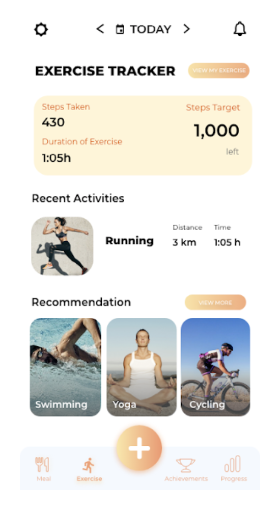 |
| Fig 1.4 Homepage layout |
Feedback : Sr Razif said that the layout is okay but the footer could make it more blue. It would look nicer that way. This applies to all of the home pages (meal tracker, exercise tracker, achievement, progress). Also changed view my exercises button to my exercises.
 |
| Fig 1.5 Changes in Footer |
 |
| Fig 1.6 Changes in button to "My Exercises" |
I also changes the notification pop up because before the illustration doesn't look nice.
 |
| Fig 1.7 Previous pop up notification |
 |
| Fig 1.8 Changes in pop up notification |
Here is the link to the updated app design: https://drive.google.com/file/d/1E5VdBi--2MBAh_IGJmdKIn-xmznblAAB/view?usp=sharing
Here's my proposal :
Fig 1.9 Proposal
Project 2 : App Progression
12/6/20 (Week 9) - 10/7/20 (Week 13)
This week, we had to start coding in Dreamweaver using the tutorials about jQuery Mobile that were taught the previous weeks. Here are the progress:
 |
| Fig 1.10 Process in Dreamweaver |
Some of my pages require Javascript so that the users can interact. I found a website that functions as a jquery plugin to be able to swipe/ work as a slider. Here's the link : https://swiperjs.com
This is the page I'm going to apply the jquery plugin:
 |
| Fig 1.11 Changes in Layout |
 |
| Fig 1.12 Outcome after using swiper.js plugin |
Original Layout :
 |
| Fig 1.13 Target Weight Previous Layout |
Changes :
 |
| Fig 1.14 Target Weight Layout Changes |
Feedback : I showed Sr Razif and he said overall it's okay.
I also used date picker script so that when the user clicks on the calendar, it pops into a calendar where the user can select the date, month and year instead of typing. This is what it looks like in browser, but when I tried in phone it's different (shown in submission recording).
 |
| Fig 1.15 Calendar Pop up |
I also used a jquery plugin for time picker where the user has to pick the time at this page. Here's the outcome:
 |
| Fig 1.16 Time Picker Javascript Plugin |
I also added jquery mobile option picker so that user can just pick instead of typing. Here's the outcome :
 |
| Fig 1.17 Option picker |
For the animation, I used what Sr Razif taught us in class which is gsap animation. However, I also wanted to add animation where the number is generating which I found online. Here's the outcome :

Fig 1.18 Animation example
Final Project Submission
17/7/20 (Week 14)-22/7/20 (Week 15)
For icon design, I decided to make the background the orange gradient as it is used in the app. Also, the weight icon to show that this app is Weight Coach. I also did a mockup to see how it looks like in the phone.
 |
| Fig 1.19 Icon Design |
 |
| Fig 1.20 Mockup in Phone |
Here's the folder submission link : https://drive.google.com/drive/folders/16XQapVssC3vi-bcV_CLZXe59BRtj1gUo?usp=sharing
Here's the link to my app which I uploaded to server : http://thedesignschool.taylors.edu.my/newmedia/appdesign2/maydeline/
I also recorded my app walkthrough in both browser and phone as there's some difference if I view it in my phone.
Fig1.21 App Walkthrough recorded in android phone
Fig 1.22 App Walkthrough recorded in Browser
FEEDBACK
Week 2
Specific Feedback : The website is overall good but you can fix some of the spacing because in the website it looks okay. However, when it's responsive(reduce to mobile size), you can add more padding.
Week 4
Specific Feedback : The color for exercise pages are too gloomy, maybe the color of the text could be changed from black to white. If the white is too blinding, add just a little bit of shadow. For the navbar, maybe make the blue a little bit darker. Change "View My Exercises" to "My Exercises" because it's too long and it doesn't look so nice if it's too long. For the notification, you can make it as a pop up instead of another screen. For the feedback section, if you want to add it, you can change the alignment of the text.
Week 10
Specific Feedback : I asked Sr Razif for same pages that needs interaction and he told me some suggestion and he's also trying some javascript.
Week 13
Specific Feedback : I showed changes in target weight page and Sr Razif said it's okay.
Comments
Post a Comment