INTERACTIVE DESIGN - FINAL PROJECT
INTERACTIVE DESIGN - FINAL PROJECT
 (20.06.19 - 04.07.19 (Week 11 - Week 14)
Maydeline (0335392)
Interactive Design
Final Project
LECTURES
Lecture 11 : -
20.06.19 (Week 12)
There is no lecture this week as we continued planning for our final project.
Lecture 12 : -
27.06.19 (Week 13)
We had no lecture this week as we continued our final project using Dreamweaver.
Lecture 13 : -
04.07.19 (Week 14)
We had no lecture this week as we continued on our final project.
INSTRUCTIONS
FINAL PROJECT
Week 11
This project requires us to create a website for a classmate. This website could be portfolio or anything else, but I choose to make portfolio for my classmate, Crystallyn. She provided for me the pictures and contents that are going to be in the website. In addition, we also discussed about the moodboard, color scheme and wireframe.
At first we wanted to go with the color scheme but then we had an idea of making an edgy and duotone color so we chose another color scheme.
We finalised our ideas and contents and exchanged. I started coding in Dreamweaver, and also I used a free bootstrap template which I found online called Stylish Portfolio. It matches how Crystallyn wants her website to looks like.
https://startbootstrap.com/previews/stylish-portfolio/
In addition, I also used another bootstrap template called Agency.
https://startbootstrap.com/previews/agency/
Week 12 - Week 13
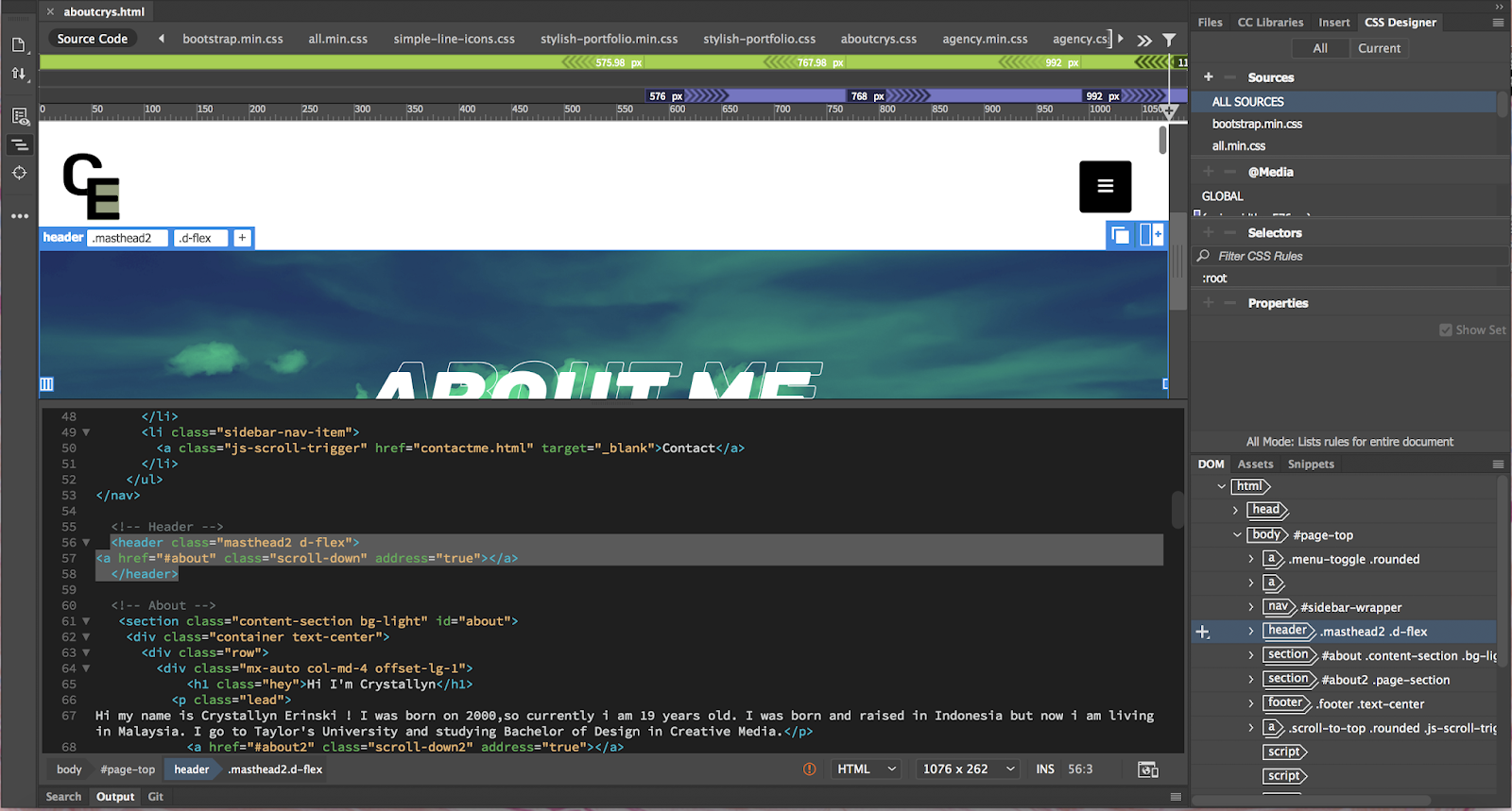
I did the landing page (home) first and insert some images and logo.
I showed to Mr Shamsul my landing page and he said that it's okay and I can continue doing the next pages. He reminded me to maintain the consistency of the website. I moved on to another pages which are about, projects, personal works and contact.
I continued on doing 3 more pages which are projects, personal works and contacts. I used the Agency bootstrap because it fits well to showcase the compilation of projects and personal works.
Here is the final outcome that I have uploaded in 000webhost :
https://maydelinejong.000webhostapp.com/final%20project/index.html
FEEDBACK
Week 11
Specific Feedback : Sr Lun told me to use column to make my website responsive cause I forgot to put it in my event section. The button in home page is too big, he told me to reduce the size.
Week 12
Specific Feedback : Mr Shamsul said my website is responsive, it's basic but okay. The logo on navigation bar should be removed from the ul. For the about section, it should be heading, sub-heading then content. In the event section, I need to add pictures. For footer, the middle area is a bit empty so I could delete the "Follow Us on Social Media" and place the social media logos in the middle. The RSVP section also isn't clear, maybe I could change the form to name and email address.
Week 13
Mr Shamsul said my landing page (home) is okay but I need to make sure that the next few pages are consistent.
Week 14
Mr Shamsul said that my website is good and he said that its good how mine and my partner Crystal's look different even though we used the same bootstrap template and also we modified enough from the original bootstrap.
REFLECTION
Experiences
Week 11
This week I had trouble to make the website responsive but after being taught by the lecturer about the column grids, I became aware and apply the columns in my website.
Week 12
It's my first time designing and coding a 5 pages HTML website which was really tough at first. But then I got more used to it and could modify the website easily using css.
Week 13
This week, it is fun to make landing page as I got to also design for Crystal as well. I got to learn her style and also modifying the bootstrap template. I added a bit of CSS animation as well and it is really fascinating.
Week 14
I enjoyed doing website for my classmate Crystallyn and I was satisfied with the final result as she also felt the same way. It took quite a long time but it's worth it. I'm happy for Crystal is happy with the result of the website I have made for her.
Observations
Week 11
I observed that there are lots of styles that we can use for our website depends on what we want it to be. Hence, planning out with moodboard and wireframe sketches would be very useful.
Week 12
I observed that bootstrap is very helpful as we just have to modify, but finding the css could be very confusing sometimes as bootstrap has lots of css and javascript. However, once I found the right css, it became easier and convenient.
Week 13
I observed how consistency is very important in website. Once we stick to a style, other pages should follow that style as well. If not, the page would look like it comes from another different website.
Week 14
I observed lots of tutorials that could add a bit animation into my website. I tried it out and if I followed the steps properly, it worked and would appear such as the scroll-down button that I have added.
Findings
Week 11
I found that it is fun to be able to a design website for a friend based on the content that were given to me. I got to design something based on their style which is interesting.
Week 12
I found how bootstrap is very essential and convenient as it makes the website responsive. By making the website responsive, we can also view the website in mobile sized screen.
Week 13
Through the past exercises and projects, all of them had really helped me to learn the basics of coding which make it easier for me now to coding in Dreamweaver compared to previous weeks.
Week 14
I found how I have always play safe and stick to basic website but I tried to make my website eye-catching and not boring. In addition, I also found how the size of the button plays a major role so that people/users could see the button.
FURTHER READINGS
Week 11 - Week 12
How Visual Design Makes for Great UX
Chapter : What it means for UX designers
https://www.uxbooth.com/articles/how-visual-design-makes-for-great-ux/
For UX designers, there 2 main takeaways. First, don't rely on visual design alone to save a bad experience. The most attractive visuals won't fix features or functionality that is wrong for the user or poorly constructed. Second, don't ignore visual design! We all have competition, and visual design can be strategic differentiator that encourages users to value one application over another equally usable one.
Here's a best of, for UX designers looking to get started:
Week 13 - Week 14
Art Direction For The Web Using CSS Shapes
https://www.smashingmagazine.com/2019/04/art-direction-for-the-web-using-css-shapes/#v-shapes
CSS shapes to create the following five different types of layout:
1. V-shapes
To create this shape layout, we only need to specify the URL of an image file as the shape-outside value:
2. Z-pattenrs
3. Curved shapes
4. Diagonal shapes
5. Rotated shapes
Maydeline (0335392)
Interactive Design
Final Project
LECTURES
Lecture 11 : -
20.06.19 (Week 12)
There is no lecture this week as we continued planning for our final project.
Lecture 12 : -
27.06.19 (Week 13)
We had no lecture this week as we continued our final project using Dreamweaver.
Lecture 13 : -
04.07.19 (Week 14)
We had no lecture this week as we continued on our final project.
INSTRUCTIONS
FINAL PROJECT
Week 11
This project requires us to create a website for a classmate. This website could be portfolio or anything else, but I choose to make portfolio for my classmate, Crystallyn. She provided for me the pictures and contents that are going to be in the website. In addition, we also discussed about the moodboard, color scheme and wireframe.
 |
| Fig 1.1 Color Scheme |
 |
| Fig 1.2 Wireframe sketch |
 |
| Fig 1.3 Wireframe sketch |
 |
| Fig 1.4 Reference |
 |
| Fig 1.5 Reference |
At first we wanted to go with the color scheme but then we had an idea of making an edgy and duotone color so we chose another color scheme.
 |
| Fig 1.6 Moodboard |
We finalised our ideas and contents and exchanged. I started coding in Dreamweaver, and also I used a free bootstrap template which I found online called Stylish Portfolio. It matches how Crystallyn wants her website to looks like.
 |
| Fig 1.7 Bootstrap template |
In addition, I also used another bootstrap template called Agency.
 |
| Fig 1.8 Bootstrap template |
Week 12 - Week 13
I did the landing page (home) first and insert some images and logo.
 |
| Fig 1.9 Process in Dreamweave |
 |
| Fig 1.10 Home page (1) |
 |
| Fig 1.11 Home page (2) |
 |
| Fig 1.12 Home page (3) |
 |
| Fig 1.13 Home page (4) |
 |
| Fig 1.14 Process |
 |
| Fig 1.15 About Section (1) |
 |
| Fig 1.13 About Section (2) |
 |
| Fig 1.16 About Section (3) |
 |
| Fig 1.17 Process |
 |
| Fig 1.18 Projects Section (1) |
 |
| Fig 1.19 Projects Section (2) |
 |
| Fig 1.20 Projects Section (3) |
 |
| Fig 1.21 Personal Works Page |
 |
| Fig 1.22 Contact Me Page |
https://maydelinejong.000webhostapp.com/final%20project/index.html
FEEDBACK
Week 11
Specific Feedback : Sr Lun told me to use column to make my website responsive cause I forgot to put it in my event section. The button in home page is too big, he told me to reduce the size.
Week 12
Specific Feedback : Mr Shamsul said my website is responsive, it's basic but okay. The logo on navigation bar should be removed from the ul. For the about section, it should be heading, sub-heading then content. In the event section, I need to add pictures. For footer, the middle area is a bit empty so I could delete the "Follow Us on Social Media" and place the social media logos in the middle. The RSVP section also isn't clear, maybe I could change the form to name and email address.
Week 13
Mr Shamsul said my landing page (home) is okay but I need to make sure that the next few pages are consistent.
Week 14
Mr Shamsul said that my website is good and he said that its good how mine and my partner Crystal's look different even though we used the same bootstrap template and also we modified enough from the original bootstrap.
REFLECTION
Experiences
Week 11
This week I had trouble to make the website responsive but after being taught by the lecturer about the column grids, I became aware and apply the columns in my website.
Week 12
It's my first time designing and coding a 5 pages HTML website which was really tough at first. But then I got more used to it and could modify the website easily using css.
Week 13
This week, it is fun to make landing page as I got to also design for Crystal as well. I got to learn her style and also modifying the bootstrap template. I added a bit of CSS animation as well and it is really fascinating.
Week 14
I enjoyed doing website for my classmate Crystallyn and I was satisfied with the final result as she also felt the same way. It took quite a long time but it's worth it. I'm happy for Crystal is happy with the result of the website I have made for her.
Observations
Week 11
I observed that there are lots of styles that we can use for our website depends on what we want it to be. Hence, planning out with moodboard and wireframe sketches would be very useful.
Week 12
I observed that bootstrap is very helpful as we just have to modify, but finding the css could be very confusing sometimes as bootstrap has lots of css and javascript. However, once I found the right css, it became easier and convenient.
Week 13
I observed how consistency is very important in website. Once we stick to a style, other pages should follow that style as well. If not, the page would look like it comes from another different website.
Week 14
I observed lots of tutorials that could add a bit animation into my website. I tried it out and if I followed the steps properly, it worked and would appear such as the scroll-down button that I have added.
Findings
Week 11
I found that it is fun to be able to a design website for a friend based on the content that were given to me. I got to design something based on their style which is interesting.
Week 12
I found how bootstrap is very essential and convenient as it makes the website responsive. By making the website responsive, we can also view the website in mobile sized screen.
Week 13
Through the past exercises and projects, all of them had really helped me to learn the basics of coding which make it easier for me now to coding in Dreamweaver compared to previous weeks.
Week 14
I found how I have always play safe and stick to basic website but I tried to make my website eye-catching and not boring. In addition, I also found how the size of the button plays a major role so that people/users could see the button.
FURTHER READINGS
Week 11 - Week 12
How Visual Design Makes for Great UX
Chapter : What it means for UX designers
https://www.uxbooth.com/articles/how-visual-design-makes-for-great-ux/
For UX designers, there 2 main takeaways. First, don't rely on visual design alone to save a bad experience. The most attractive visuals won't fix features or functionality that is wrong for the user or poorly constructed. Second, don't ignore visual design! We all have competition, and visual design can be strategic differentiator that encourages users to value one application over another equally usable one.
Here's a best of, for UX designers looking to get started:
- Stay consistent : Inconsistency will turn even the most beautiful design into an ugly mess. This is one area where feeling leads vision; if a user is confused by the site, that feeling will make a site appear ugly in the eyes.
- Test visual concepts are as well as paper prototypes : We respond strongly to visuals, and branding done well can influence how much we trust and respond to interactions.
- Don't get distracted by trends : There's a reason the little black dress has stayed in fashion over the past 11 years. It's simple. It's clean. It's classic. Equally, a simple, clean, classic visual design will hold up over time, in a way that trends can't promise. While it's likely that some aspects of flat design will remain, on the whole it's likely to leave a lot of apps looking so 2015 in a few years.
Week 13 - Week 14
Art Direction For The Web Using CSS Shapes
https://www.smashingmagazine.com/2019/04/art-direction-for-the-web-using-css-shapes/#v-shapes
CSS shapes to create the following five different types of layout:
1. V-shapes
To create this shape layout, we only need to specify the URL of an image file as the shape-outside value:
  [src*="shape-left"],
[src*="shape-right"] {
  width: 50%;
  height: 100%;
}

[src*="shape-left"] {
  float: left;
  shape-outside: url('alpha-left.png');
}

[src*="shape-right"] {
  float: right;
  shape-outside: url('alpha-right.png');
}
 |
| Fig 2.1 V-shapes layout |
2. Z-pattenrs
  [src*="placeholder-left"],
[src*="placeholder-right"] {
  display: block;
  width: 240px;
  height: 100%;
}

[src*="placeholder-left"] {
  float: left;
  shape-outside: url('shape-right.png');
}

[src*="placeholder-right"] {
  float: right;
  shape-outside: url('shape-right.png');
}
 |
| Fig 2.2 Z-patterns layout |
3. Curved shapes
[src*="curve"] {
  float: right;
  width: 400px;
  height: 100vh;
  shape-outside: url('curve.png');
} |
| Fig 2.3 Curved shapes layout |
4. Diagonal shapes
[src*="shape"] {
  float: left;
  shape-outside: url('shape.png');
  shape-margin: 3rem;
} |
| Fig 2.4 Diagonal shapes layout |
5. Rotated shapes
  [src*="shape"] {
  float: right;
  width: 50%;
  shape-outside: url('alpha.png');
  shape-margin: 1rem;
}
 |
| Fig 2.5 Rotated shapes layout |


Comments
Post a Comment