ADVANCED TYPOGRAPHY - FINAL PROJECT
ADVANCED TYPOGRAPHY - FINAL PROJECT
 28.05.19 - 25.06.19 (Week 9 - Week 13)
Maydeline (0335392)
Advanced Typography
Final Project
Design, Exploration and Application
LECTURES
Lecture 10 : -
03.06.19 (Week 10)
We had no lecture this week as it is an e-learning week.
Lecture 11 : Typography in Different Mediums & Typography: Perception & Organisation
11.06.19 (Week 11)
This week, 2 lectures were conducted in the class which were about experimental typography and also typography in different mediums. These lectures could help and inspire us for our final project.
Here is the first presentation about Typography in Different Mediums :
INSTRUCTIONS
FINAL PROJECT - DESIGN, EXPLORATION & APPLICATION
28.05.19 (Week 9) - 03.05.19 (Week 10)
This week we were briefed about our final project which is where we have 2 options, either creating a typeface or fixing a problem and provide a purpose/reason as a support statement for the problem. It will be very open. It could also be connected to our specialisation. I started searching for some ideas and some examples were also given by the lectures.
I researched more about design exploration done by other designers and it gave me more ideas which are listed down below.
11.06.19 - 18.06.19 (Week 11 - Week 12)
After consulting with Mr Vinod again, he told me that the second idea which is the tribal typeface is much more interesting, the only problem is how my reference is bad because I should not make the typeface decorative. I researched more on examples that would help me and I found a few.
I found how tattoo is very important in Mentawai Tribe and it's a must to have tattoos. Their tattoos have similar patterns and I decided to take the patterns and apply it to the typeface to show a hint of the tribe.
I started sketching and digitising some alphabets and got to show to the lecturers. Mr Vinod and Mr Shamsul told me that it's not decorative and they told instead of making the strokes too thick, I could follow the thickness of the tattoo patterns. In addition, I could also make the strokes like sans serif where the right arm is thicker than the left arm.
After showing Mr Vinod, he told me that C,D,G,H,I,M,O and W are rudimentary and I needed to refine more. In addition, he also asked me to fix the curve of the C. I took the feedback and refined those alphabets.
After showing both lecturers, they said that it's much better than before but they suggested me to change the curve stroke of the B,D, P, Q, R because it looks awkward right now.
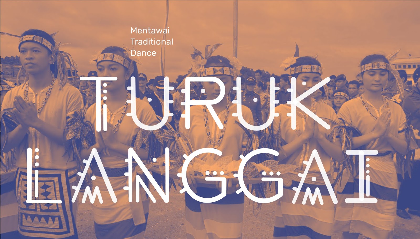
After showing the lecturers, they approved and asked me to move on to the application. They asked me what I wanted to do for the application and I told them about the Mentawai Festival and they had the poster which was really ugly. Overall, I wanted to make a promotional poster for the tribe. They agreed with the application and guided me on how to do it.
25.06.19 (Week 13)
I searched for some words about Mentawai Tribe and I found this word called "Lia Eeruk" which is a traditional wedding ceremony of the Mentawai Tribe. I tried to do one duotone image and place that word.
I showed Mr Vinod and he asked me to keep it up and also put a translation below the "Lia Eeruk". I took the feedback and added some more words. Yet, I continue to do more images.
After showing Mr Vinod during Friday class, he told me that it's good but to make it better I could change the alignment of the transaction sentences and align with the letters.
FEEDBACK
Week 10
Online Feedback: All are good but the example typefaces you used for the last two are not very nice... the examples are too decorative, I hope, should you design a typeface, you would not make it so dramatic or decorative.
Week 11
Specific Feedback: Mr Vinod said that I should go with the 2nd idea because it is more interesting, but he said that if I can do the first one better then go ahead. He said that my references are not good and I should took that as a bad example and improve it.
General Feedback: Mr Vinod and Mr Shamsul reminded us not to put our image in png but jpeg instead. In addition, we should put our collaterals and key artwork in a flat lay.
Week 12
Specific Feedback: After showing Mr Vinod and Mr Shamsul for my letter A and B, they said it's hard to tell if it's ok or not but it's not decorative and interesting as how I took the pattern from the toes. Mr Vinod also showed me that the thickness of the stroke is a bit awkward so he suggested me to follow the stroke in the tattoo. In addition, Mr Vinod suggested me to follow the stroke thickness of sans serif where it is thicker on the right stroke than the left one. (For example: Source Sarif Variable)
Online Feedback: (C,D,G,H,I,M,O,S,W) Presently I think they are rudimentary. Maybe a little more refinement needed. But you need to manage your time because you have to apply this soon. Can you curve the C in a better way.
Week 13
General Feedback : Mr Vinod and Mr Shamsul told us to take a picture of the poster hanging on the wall and also for the t-shirt, we need someone to wear it and take picture of the person wearing it.
Specific Feedback: (Monday) After showing Mr Vinod and Mr Shamsul what I had fixed, they told me it's better but the curves of the B, D, P, Q, R are awkward so I could make it curve like C. After I fixed again, they approved the overall typeface and asked me to move on to the application. I told them I wanted to make a promotional poster about the Mentawai Festival because they had this poster which was really bad and the lecturers agreed with me. They said I should move on to the promotional poster. In addition, Mr Vinod suggested me to make promotional images included with Mentawai words (language) and translation on the images. He also asked me to try to use duotone colors.
(Friday) Mr Vinod told me that it looks great but to make it better I could change the alignment of the translation text and align them with the letters. He also reminded me to make all the images same sizes. In addition, he told me to perfect the promotional images first before proceeding to the poster if I have time.
Online Feedback : Yes. Use words or sentences from that language and then have a translation below. Keep it up. You need to add information details, sponsors, address, website... refer to your sample!
REFLECTION
Experiences
Week 10
I kept researching and looking at designers' works of how they experiment with typography in different types of methods and materials which were very eye-catching. Some were great but some were uniquely strange.
Week 11
I had a tough time choosing my idea because I liked both of my ideas which were the menu and the tribal typeface but after considering, I have finally decided to focus on the tribal typeface instead. I started researching about the tribe itself.
Week 12
I had a bit of a hard time maintaining the consistency and the thickness of the strokes and that was where my lecturers helped and guided me to create the alphabets so that they won't turn out looking awkward.
Week 13
This week I got to experiment more on editing the images. I had a fun time applying duotone colors onto the images because I have always found them in websites nowadays. Balancing and choosing 2 colors isn't easy but I like how I could mix and match to get the good combination.
Observations
Week 10
I was observing several interesting experimental typography and most of the results were extraordinary which motivated me to do something unique as well and it helped me come up with some ideas.
Week 11
I explored more about Mentawai Tribe's trademarks so that I can apply it to my typeface to give a hint of the tribe itself which makes it a bit more unique.
Week 12
I observed my typeface and compared it with existing typeface as a visual reference so that I know which parts look awkward or which one is wrong. I kept refining until I got there.
Week 13
I observed how my classmates created their typefaces and applied them on their chosen application. There were various interesting ones which inspired me to do something like that as well. As I proceeded on my application, I observed I should be aware in small details in designing.
Findings
Week 10
I found out how it takes lots of thinking and time to find inspiration for their amazing works. I faced difficulties in finding one but I kept thinking to find some interesting and unique ideas, and it would be nice if it is related to my country.
Week 11
I found out how there aren't lots of tribal typefaces these days which encouraged me to make one. The existing ones are mostly too decorative yet they set bad examples for typefaces. However, some were great.
Week 12
Through working on the typefaces, I found how existing typefaces have consistency which show that every letters have the same thickness of strokes, curves, height and width which was very helpful as a reference for me.
Week 13
I found out how to make duotone images in photoshop where I could choose 2 colors and mix and match those colors. I found some references in Pinterest which could guide me.
FURTHER READINGS
Week 10 - Week 11
The Main Rules of Typography
https://medium.com/@v.khlopotova/the-main-rules-of-typography-ce53d297f7dd
1. Grid
The grid is a set of columns and lines on which you have your text. At first glance, it may seem that it is not necessary, but it is. Use the grid always. It helps you to make the page clean and readable.
2. Font
Firstly, don't use more than 2 fonts. You can use one but in different typefaces. Secondly, use contrasting fonts- Serif for headings and Sans Serif for main text. Or on the contrary. Two identical fonts look sloppy. Use classical time-tested fonts. Do not use unusual fonts, if you don't know why you need it. Be careful with colors.
3. Length of line
To make your text convenient to read, keep the line length at 40-65 characters.
4. Line spacing
The distance between the lines should have enough space, but not be too large. The ideal line spacing is 125% of the font size.
5. Size matters
The size of the text in the web should not be less than 13 pixels. The best choice is in the range of 14-18 px.
6. Justification
Justification on left is easy to read as if you are reading from left to right. Avoid justification on right and be very careful with justification on center.
7. Word wrapping
Try to avoid word wrapping at all by using the justification on left. If you need to wrap words, do it according to grammar rules. And do not use multiple wrappings in a row. More than three can not be used.
8. Indent
Select one of the ways to separate paragraphs from each other and stick to it throughout the text. You can indent at the beginning of a paragraph, or separate paragraphs with an empty line. But don't use both ways simultaneously.
9. Widows and orphans
Widow is one word on a whole line at the end of a paragraph or a very short line at the end of a text or page. Orphan is a false line that gets to the beginning of a new page or column. They should be avoided. Try to reduce the letter spacing, move the line or adjust the font size. Don't let widows and orphans get into your text.
10. Letter spacing
Don't increase the distance between lowercase letters and don't decrease between uppercase letters. Increasing the distance by 10% between uppercase letters will make your text more readable.
11. Rivers
When you wrote your text, check it for rivers. Squint and look. You shouldn't have many spaces down in a row and it shouldn't resemble a labyrinth. You can avoid by changing the sentence, the Kegel or the length of line.
Week 12 - Week 13
Design Elements Typography Fundamentals : A Graphic Style Manual for Understanding How Typography Affects Design
Chapter : Selection Considerations on Typefaces
Take time to read and grasp the text as well as possible. Get a sense of its mood and energy. Pinpoint with the main message. Context initiates decision-making. Next, carefully map the text. Note its quantity and variety, or types of text, then order it by importance. Determine the technical needs of a typeface, such as stylistic range (posture, weight, and width) or special features (ligatures, numeral styles, and small caps), to create hierarchy.
An attention-grabbing display face might echo the title perfectly, as a modest face conveys supporting text. Think first of the text and its typesetting needs, then make appropriate choices. Determine medium, users, and viewing conditions. Typefaces for environments observed from a distance very greatly from tablets seen inches away. Observing type in practice is a great way to learn.
Typefaces create atmosphere. They spark emotions and express historical, contemporary, or cultural con-notations-all before the text is read. A fitting typeface personality makes an impression. Here is an example of Baskerville revival is a serif typeface featuring open counters and supple curves. A notable feature is its extensive ligatures. It is stylish, charismatic, and gracious.
Another example is Clarendon which was made by Rober Besley. ITs distinctive slab serifs make it stand out in display settings. Bracketed serifs and ball terminals contribute to its friendly, stout personality.
Examine the design of typefaces. Look for legible, well-proportioned, and acutely crafted characters. When typeset, words and lines read fluidly. Reliable typefaces have consistent styles (posture, weight, and width) to provide for typographic variation and emphasis.
Maydeline (0335392)
Advanced Typography
Final Project
Design, Exploration and Application
LECTURES
Lecture 10 : -
03.06.19 (Week 10)
We had no lecture this week as it is an e-learning week.
Lecture 11 : Typography in Different Mediums & Typography: Perception & Organisation
11.06.19 (Week 11)
This week, 2 lectures were conducted in the class which were about experimental typography and also typography in different mediums. These lectures could help and inspire us for our final project.
Here is the first presentation about Typography in Different Mediums :
Here is the second presentation about Typography : Perception & Organisation
Lecture 12 : -
18.06.19 (Week 12)
We had no lecture this week as we continued with our final project.
Lecture 13 : -
25.06.19 (Week 13)
We had no lecture this week as we continued with our final project.
INSTRUCTIONS
FINAL PROJECT - DESIGN, EXPLORATION & APPLICATION
28.05.19 (Week 9) - 03.05.19 (Week 10)
This week we were briefed about our final project which is where we have 2 options, either creating a typeface or fixing a problem and provide a purpose/reason as a support statement for the problem. It will be very open. It could also be connected to our specialisation. I started searching for some ideas and some examples were also given by the lectures.
 |
| Fig 1.1 Example |
 |
| Fig 1.2 Example |
 |
| Fig 1.3 Example |
I researched more about design exploration done by other designers and it gave me more ideas which are listed down below.
Fig 1.4 Ideas
11.06.19 - 18.06.19 (Week 11 - Week 12)
After consulting with Mr Vinod again, he told me that the second idea which is the tribal typeface is much more interesting, the only problem is how my reference is bad because I should not make the typeface decorative. I researched more on examples that would help me and I found a few.
Fig 1.5 Final Idea
 |
| Fig 1.6 Typeface Reference |
 |
| Fig 1.7 Typeface Reference |
 |
| Fig 1.8 Typeface Reference |
 |
| Fig 1.9 Mentawai Tribe Tattoo |
 |
| Fig 1.8 1st attempt of A and B |
 |
| Fig 1.9 1st attempt A-Z |
 |
| Fig 1.10 2nd attempt on C & D |
 |
| Fig 1.11 2nd attempt on G,H,I |
 |
| Fig 1.12 2nd attempt on M |
 |
| Fig 1.13 2nd attempt on O |
 |
| Fig 1.14 2nd attempt on S |
 |
| Fig 1.15 2nd attempt on W |
 |
| Fig 1.16 2nd attempt on B |
 |
| Fig 1.17 2nd attempt on D |
 |
| Fig 1.18 2nd attempt on P,Q,R |
I noticed that the curve of the P,Q,B are not consistent so I make it more curve.
 |
| Fig 1.19 3rd attempt on P,Q,R |
Mr Vinod and Mr Shamsul said that the 2nd attempt of P,Q,R (Fig 1.18) are better so I should stick with that instead. So here is the final A-Z alphabets.
 |
| Fig 1.20 Final Outcome Mentawai Tribal Typeface |
Fig 1.21 Embedded PDF of Final Outcome of Mentawai Tribal Typeface
25.06.19 (Week 13)
I searched for some words about Mentawai Tribe and I found this word called "Lia Eeruk" which is a traditional wedding ceremony of the Mentawai Tribe. I tried to do one duotone image and place that word.
 |
| Fig 1.21 1st attempt of promotional image |
 |
| Fig 1.22 2nd attempt of promotional images |
 |
| Fig 1.23 Final promotional image (1) |
 |
| Fig 1.24 Final promotional image (2) |
 |
| Fig 1.25 Final promotional image (3) |
 |
| Fig 1.26 Final promotional image (4) |
 |
| Fig 1.27 Final promotional image (5) |
 |
| Fig 1.28 Final compilation of promotional images |
Fig 1.29 PDF Final compilation of promotional images
Next, I also had to make a promotional poster for the Mentawai Pesona Festival which is a traditional festival which promotes national and international tourism to Mentawai Islands and also showcases the Mentawai culture. The reason why I wanted to create the promotional poster is because the existing poster itself isn't good and I wanted to fix the poster itself.
 |
| Fig 1.30 Reference Poster |
 |
| Fig 1.31 Reference Poster |
 |
| Fig 1.32 1st attempt Mentawai Pesona Festival Poster |
I need to add more information in the poster such as sponsors, address, website or other relevant information, so I refer to an existing poster.
I realised that the color is a bit too dark so I decided to change the colors.
 |
| Fig 1.33 Existing Mentawai Pesona Festival 2019 Poster |
 |
| Fig 1.34 2nd attempt Mentawai Pesona Festival Poster |
 |
| Fig 1.35 Final Outcome Mentawai Pesona Festival Poster |
Fig 1.36 Embedded PDF Final Outcome Mentawai Pesona Festival Poster
Final Submission
 |
| Fig 2.1 Final Outcome Mentawai Tribal Typeface |
Fig 2.2 Embedded PDF of Final Outcome of Mentawai Tribal Typeface
|
| Fig 2.3 Final Outcome Promotional Images Fig 2.4 Embedded PDF Final Outcome Promotional Images |
 |
| Fig 2.5 Final Outcome Mentawai Pesona Festival Poster |
Fig 2.6 Embedded PDF Final Outcome Mentawai Pesona Festival Poster
FEEDBACK
Week 10
Online Feedback: All are good but the example typefaces you used for the last two are not very nice... the examples are too decorative, I hope, should you design a typeface, you would not make it so dramatic or decorative.
Week 11
Specific Feedback: Mr Vinod said that I should go with the 2nd idea because it is more interesting, but he said that if I can do the first one better then go ahead. He said that my references are not good and I should took that as a bad example and improve it.
General Feedback: Mr Vinod and Mr Shamsul reminded us not to put our image in png but jpeg instead. In addition, we should put our collaterals and key artwork in a flat lay.
Specific Feedback: After showing Mr Vinod and Mr Shamsul for my letter A and B, they said it's hard to tell if it's ok or not but it's not decorative and interesting as how I took the pattern from the toes. Mr Vinod also showed me that the thickness of the stroke is a bit awkward so he suggested me to follow the stroke in the tattoo. In addition, Mr Vinod suggested me to follow the stroke thickness of sans serif where it is thicker on the right stroke than the left one. (For example: Source Sarif Variable)
Online Feedback: (C,D,G,H,I,M,O,S,W) Presently I think they are rudimentary. Maybe a little more refinement needed. But you need to manage your time because you have to apply this soon. Can you curve the C in a better way.
Week 13
General Feedback : Mr Vinod and Mr Shamsul told us to take a picture of the poster hanging on the wall and also for the t-shirt, we need someone to wear it and take picture of the person wearing it.
Specific Feedback: (Monday) After showing Mr Vinod and Mr Shamsul what I had fixed, they told me it's better but the curves of the B, D, P, Q, R are awkward so I could make it curve like C. After I fixed again, they approved the overall typeface and asked me to move on to the application. I told them I wanted to make a promotional poster about the Mentawai Festival because they had this poster which was really bad and the lecturers agreed with me. They said I should move on to the promotional poster. In addition, Mr Vinod suggested me to make promotional images included with Mentawai words (language) and translation on the images. He also asked me to try to use duotone colors.
(Friday) Mr Vinod told me that it looks great but to make it better I could change the alignment of the translation text and align them with the letters. He also reminded me to make all the images same sizes. In addition, he told me to perfect the promotional images first before proceeding to the poster if I have time.
Online Feedback : Yes. Use words or sentences from that language and then have a translation below. Keep it up. You need to add information details, sponsors, address, website... refer to your sample!
REFLECTION
Experiences
Week 10
I kept researching and looking at designers' works of how they experiment with typography in different types of methods and materials which were very eye-catching. Some were great but some were uniquely strange.
Week 11
I had a tough time choosing my idea because I liked both of my ideas which were the menu and the tribal typeface but after considering, I have finally decided to focus on the tribal typeface instead. I started researching about the tribe itself.
Week 12
I had a bit of a hard time maintaining the consistency and the thickness of the strokes and that was where my lecturers helped and guided me to create the alphabets so that they won't turn out looking awkward.
Week 13
This week I got to experiment more on editing the images. I had a fun time applying duotone colors onto the images because I have always found them in websites nowadays. Balancing and choosing 2 colors isn't easy but I like how I could mix and match to get the good combination.
Observations
Week 10
I was observing several interesting experimental typography and most of the results were extraordinary which motivated me to do something unique as well and it helped me come up with some ideas.
Week 11
I explored more about Mentawai Tribe's trademarks so that I can apply it to my typeface to give a hint of the tribe itself which makes it a bit more unique.
Week 12
I observed my typeface and compared it with existing typeface as a visual reference so that I know which parts look awkward or which one is wrong. I kept refining until I got there.
Week 13
I observed how my classmates created their typefaces and applied them on their chosen application. There were various interesting ones which inspired me to do something like that as well. As I proceeded on my application, I observed I should be aware in small details in designing.
Findings
Week 10
I found out how it takes lots of thinking and time to find inspiration for their amazing works. I faced difficulties in finding one but I kept thinking to find some interesting and unique ideas, and it would be nice if it is related to my country.
Week 11
I found out how there aren't lots of tribal typefaces these days which encouraged me to make one. The existing ones are mostly too decorative yet they set bad examples for typefaces. However, some were great.
Week 12
Through working on the typefaces, I found how existing typefaces have consistency which show that every letters have the same thickness of strokes, curves, height and width which was very helpful as a reference for me.
Week 13
I found out how to make duotone images in photoshop where I could choose 2 colors and mix and match those colors. I found some references in Pinterest which could guide me.
FURTHER READINGS
Week 10 - Week 11
The Main Rules of Typography
https://medium.com/@v.khlopotova/the-main-rules-of-typography-ce53d297f7dd
1. Grid
The grid is a set of columns and lines on which you have your text. At first glance, it may seem that it is not necessary, but it is. Use the grid always. It helps you to make the page clean and readable.
2. Font
Firstly, don't use more than 2 fonts. You can use one but in different typefaces. Secondly, use contrasting fonts- Serif for headings and Sans Serif for main text. Or on the contrary. Two identical fonts look sloppy. Use classical time-tested fonts. Do not use unusual fonts, if you don't know why you need it. Be careful with colors.
3. Length of line
To make your text convenient to read, keep the line length at 40-65 characters.
4. Line spacing
The distance between the lines should have enough space, but not be too large. The ideal line spacing is 125% of the font size.
5. Size matters
The size of the text in the web should not be less than 13 pixels. The best choice is in the range of 14-18 px.
6. Justification
Justification on left is easy to read as if you are reading from left to right. Avoid justification on right and be very careful with justification on center.
7. Word wrapping
Try to avoid word wrapping at all by using the justification on left. If you need to wrap words, do it according to grammar rules. And do not use multiple wrappings in a row. More than three can not be used.
8. Indent
Select one of the ways to separate paragraphs from each other and stick to it throughout the text. You can indent at the beginning of a paragraph, or separate paragraphs with an empty line. But don't use both ways simultaneously.
9. Widows and orphans
Widow is one word on a whole line at the end of a paragraph or a very short line at the end of a text or page. Orphan is a false line that gets to the beginning of a new page or column. They should be avoided. Try to reduce the letter spacing, move the line or adjust the font size. Don't let widows and orphans get into your text.
10. Letter spacing
Don't increase the distance between lowercase letters and don't decrease between uppercase letters. Increasing the distance by 10% between uppercase letters will make your text more readable.
11. Rivers
When you wrote your text, check it for rivers. Squint and look. You shouldn't have many spaces down in a row and it shouldn't resemble a labyrinth. You can avoid by changing the sentence, the Kegel or the length of line.
Week 12 - Week 13
Design Elements Typography Fundamentals : A Graphic Style Manual for Understanding How Typography Affects Design
Chapter : Selection Considerations on Typefaces
Take time to read and grasp the text as well as possible. Get a sense of its mood and energy. Pinpoint with the main message. Context initiates decision-making. Next, carefully map the text. Note its quantity and variety, or types of text, then order it by importance. Determine the technical needs of a typeface, such as stylistic range (posture, weight, and width) or special features (ligatures, numeral styles, and small caps), to create hierarchy.
An attention-grabbing display face might echo the title perfectly, as a modest face conveys supporting text. Think first of the text and its typesetting needs, then make appropriate choices. Determine medium, users, and viewing conditions. Typefaces for environments observed from a distance very greatly from tablets seen inches away. Observing type in practice is a great way to learn.
Typefaces create atmosphere. They spark emotions and express historical, contemporary, or cultural con-notations-all before the text is read. A fitting typeface personality makes an impression. Here is an example of Baskerville revival is a serif typeface featuring open counters and supple curves. A notable feature is its extensive ligatures. It is stylish, charismatic, and gracious.
 |
| Fig 2.1 Baskerville Revival |
Another example is Clarendon which was made by Rober Besley. ITs distinctive slab serifs make it stand out in display settings. Bracketed serifs and ball terminals contribute to its friendly, stout personality.
 |
| Fig 2.2 Clarendon |


Comments
Post a Comment